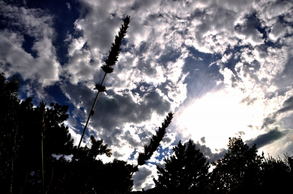
Cumulus clouds in an unstable atmosphere, taken facing south-west from South Boulder on September 3rd, 2016 at 5:18 PM. The report can be found here.
Figure 2: Skew-t plot for September 3rd, 2016

Cumulus clouds in an unstable atmosphere, taken facing south-west from South Boulder on September 3rd, 2016 at 5:18 PM. The report can be found here.
Figure 2: Skew-t plot for September 3rd, 2016
26 Comments. Leave new
This is a great photo! I like the artistic view that you were going for but the elements can be a little distracting.
I really like the foreground-background contrast, it is quite visually interesting. The saturated area around the sun doesn’t seem to detract from the image, and actually adds to the contrast. nice work!
The nature in the photo adds a nice touch, it guides the eye to the clouds which is the focus of the photo which is great. This image has Colorado written all over it! When I think of a nice summer day here, that is the picture I get in my head, very well done.
The detail captured is very nice. I like the nature feel of the image; it makes me want to go outside. Great job of keeping the image about the clouds and supplementing it with the plants; that can be hard to do.
Cool artistic angle. The trees add perspective to where you were. Also, the trees being really dark add a nice framing effect while also not distracting the eye.
Great image! I really like the sun in the image, it creates color variation in the sky that wouldn’t otherwise be present. It was very creative of you to include the grass. I love that there is only a slight amount of visible green on the stalks, it makes it so the main focus of the image is still to the clouds in the sky.
Nice take on the cloud photo by using a different perspective. The image has a full range of contrast although including the sun causes the rest of the image to be pretty dark. Given that the image has such good contrast and color is not a critical element of the scene it may make a compelling black and white photo, possibly with some adjustment to contrast and brightness to bring a little more light and detail to the shadows.
way to get artsy man, I think the lavender adds a nice touch. I like the warmth the image is conveying.
1. Artistically fantastic image with dramatic clouds and very nice composition with the plants so the image is interesting.
2. The flow is well demonstrated.
3. The photographic technique is good- cropping the image slightly on the left side may improve it.
The art statement of the flare and blown out portion is cool. Also the large range of lighting leads to a great amount of variety in the photo.
The sun offers some unique depth to the clouds as it makes some transparent and others opaque. The plant stalks offer some unique perspective, I can’t tell if it would be better with them as they are, repositioned or totally removed. Good clouds regardless.
I like the lavender in the image! The clouds are clear with good contrast!
I like how the image was almost taken pointed fully upward. The image doesn’t have a “boring” spot as every part of the image adds to the completeness. Not a big fan of the lavender stock in the middle of the image though, might be better off in the corner or taken out completely.
Great photo! It is very sharp and the clouds look sharper the closer they are to the sun.
The contrast makes the clouds very bright. I like how all the clouds seem to have a different texture to them.
Great definition and depth of image. The contrast is amazing as well. A unique angle.
Like the contrast between the bright and how you dont lose the detail in the clouds around it. I also like how the trees are almost completely black and the artsyness is very nice. You are a natural Petey
I like the perspective of he photo. feels like you are lying on the ground looking up into the photo. nice light airy clouds to give the photo a warm feel.
Nice angle. The trees/lavender stalks are a great touch. Sun is a little too bight though.
Really cool picture! These clouds look like they could be on one of those hallmark cards about entering heaven. The lavender is a creative touch! Definitely adds to the photo and frames the sun.
Nice dynamic range, I like the framing of the vegetation and trees at the bottom. Artistically, the soft edges of the plant on the right edges is a nice touch. The clouds look nicely poofy.
The flowers in the image add a nice touch. Nice giant orb of fire in the sky, it contrasts well with some of the darker elements in the clouds. Excellent focus and DOF.
Wide angle lens makes this feel very ‘first person’ which i am a fan of. Lots of nice contrast as well.
Art: The color contrast between the background and clouds is great.
Flow: The flow is quickly understandable and easily recognized.
Photographic technique: The focus of the clouds is fantastic, especially since they have very soft edges.
– The detail in this image is very clear.
– The sun adds a lot of contrast between the clouds and shrubbery.
Nice spot for a photo, really like the location with the trees and plants up close and then clouds further out.