By Alex Thompson for Get Wet 2016
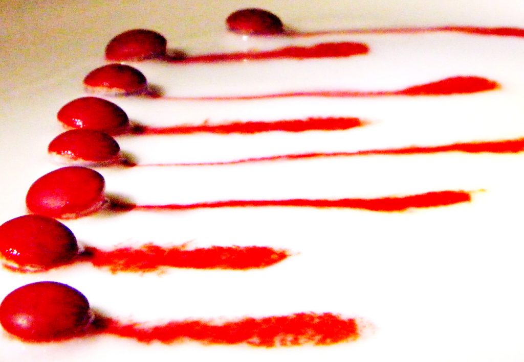
Red M&M’s candy coating dissolved when placed in a thin layer of watered-down vanilla yogurt.
See the Report: alex-thompson-get-wet-mms

By Alex Thompson for Get Wet 2016
Red M&M’s candy coating dissolved when placed in a thin layer of watered-down vanilla yogurt.
See the Report: alex-thompson-get-wet-mms
24 Comments. Leave new
so like is there any other candies that disolve in thick liquids exept m&m
Very clear intent for this image. Love the display of the shadow in front of the M&M’s. Having the light come from the other side wouldn’t have made those pop out so much. One of my favorites!
I like the artistic aspect of this. It has a nice composition, almost like a spiral notebook or something. The flow is pretty neat, I like the way the flow is more or less frozen in time. Was your ISO pretty high?
1. The image is pleasing and interesting.
2. The flow details are clearly visible.
3. The photographic technique is extremely well done with the highlights, contrast range, and colors creating the intriguing nature of the image.
The focus in this image is awesome. You did a great job bringing out the contrast with the red. The characteristics of the flow are interesting too!
I think that this is a very creative experiment. I like the red and white contrast. Personally, I didn’t even notice the top left grainy portion of the image until someone pointed it out in class. I think the red m&m’s do a great job in capturing the eye.
ISO setting created some noisy spots. Messing with the white setting and some other color settings may help remove these. I like the use of multiple items to make it artistic
Very interesting technique to make this photo, makes me hungry. I would recommend reducing the ISO to remove the grainy feel in the top of the photo. Great work!
Art: A very novel idea! Red M&M versus white yogurt. The contrast does create a visional shock.
Flow: A fairly creative flow.
Photography: Wonderful contrast control. The grainy texture might be caused by a high ISO.
Art: The contrast between white and red is great! Really makes the image pop.
Flow: Interesting, I’ve yet to hear about yogurt as a medium for color flow.
Photography: The photo seems a bit grainy, maybe have a greater light source so ISO doesn’t have to be so high.
Nice contract between the white and the bright red. The layout gives the impression of motion during a race. I agree that a lower ISO would have helped reduce some of the graininess in some spots of the photo. The best way to learn how to set these different camera settings is through experimenting with them in cases like this and seeing what they do when they are pushed to the extremes.
The photo has good contrast between the white and red. The bleeding/diffusion of the flow is interesting to see and seems easy enough to reproduce.
1. Cool image! I love the color contrast
2. it looks a bit grainy iso looks high
3. I think it is very appealing
The contrast is very interesting. The framing is also very good. The top left corner looks kind of noisy maybe and indication of a high Iso. The depth of field is well managed where the majority of the m&ms are in focus.
This is a really unique photo. I like how this was inspired by the desert. I feel this photo could benefit from some different lighting to get rid of some of the iso distortion.
The contrast between the red and the white stands out and creates an amazing image. The yogurt is an interesting medium as it disperses the red color uniquely.
Art: The color contrast between the white background and the red coloring of the M&Ms and the resulting streaks is fantastic.
Flow: The flow is quickly understandable and recognized.
Photographic technique: The focus of the the M&Ms is great.
I appreciate the distinct contrast between the reds and white. Maybe try to eliminate the plate color from the top left of the photo. I really appreciate the composition of the photo as well.
The red and white color mixing is very nice. I really like the simple aesthetic appeal of the two colors. The shallow depth of field also helps contribute to this effect. I do notice a bit of noise in the top part of the image, using a bit more light and a smaller ISO might help reduce this effect.
-Creative use of m&m’s and they have a really vivid red
-Color trails are very cool and each have unique characteristics
-Great contrast range really makes the red look nice
Art: I really enjoy how you inspired by food. Love the red/white dichotomy
Flow: love the difference in flows between each element.
Photography: it is slightly pixelated. Great work!
Interesting use of m&m’s. Nice use of only two colors. Cool to see that every streak is not the same. Details are visible. Could be a little more in focus.
It almost looks like it’s bleeding. The top left corner could be a more pure white to keep uniformity in the image. I really like the streaks created by the candies.
– This is probably one of my favorite, I’m a fan of red and white color contrasts.
– There are some instances of melted M&M’s that make really cool colors when mixed similar to a lot of the dye/milk experiments.
– The intent is realized is clearly illustrated and doesn’t have any distracting elements.