By Schuyler Vandersluis for Get Wet 2016
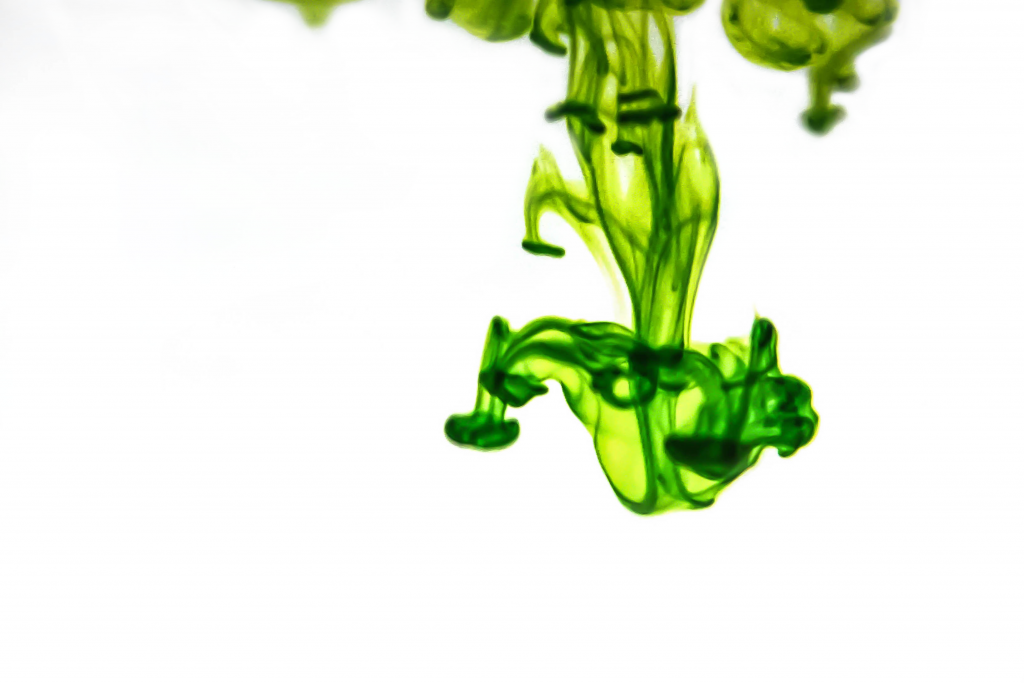
A simple drop of dye diffuses in water and creates a chaotic yet elegant chandelier flow pattern.

By Schuyler Vandersluis for Get Wet 2016
A simple drop of dye diffuses in water and creates a chaotic yet elegant chandelier flow pattern.
23 Comments. Leave new
I really enjoy how you captured this umbrella instability. It is truly just like a chandelier, an effect which the dye I used in my photo never really gave me. The white background with the green coloring makes for a stunning image.
This picture is fantastically artsy. Nice naming of your piece too. The flow is very well represented. Good photographic technique: lighting, clarity, contrast, etc.
– I like the color contrast between the greenish and white.
– The image is very clear and has a nice organic effect to it.
1. The image is well done with displaying dramatic shapes and soft texture.
2. The flow is clearly illustrated.
3. The photographic technique is very nice and the green color against the white background is well captured.
Neat image. Nice colors on the plume. Good job getting a monotone background which draws the eye to the subject. I also the like the 1/3 framing applied to the plume. The little vortex rings are especially cool.
I love the detail captured. The green looks great on the white background. The focus at the top of the image is a little lost.
I thing the negative space makes this image. Great job with the focus and providing a background that will allow the food dye to pop.
The detail of the photo is fantastic. Really nice work editing the photo to bring out the flow. I like how the flow is seemingly just sitting on a white background.
Good use of the white background (I assume in post-processing) to make the green die stand out. Why did you crop out the top where you did? Specific reason?
Really like the color presented. It is like a mixture of yellow and blue with more yellow in it and thus shows a color of live moss. Great contrast as well.
Fantastic image! Great choice of background to bring out the darker shadows of the “chandelier.” The greenish-yellow color was a great choice to make the depth of the image pop. Also, nice job focusing on the center of the downward flow. This is one of my favorite images in the 2016 Get Wet album. Great work!
The image shows a pleasant, symmetrical pattern and the instabilities diffuse downward. You captured the flow well, while the focus is not crisp at every edge. I understand this is a challenge though with diffusion experiments.
Art: Bright background mixes well with the food dye.
Flow: I love that your caption. It looks very similar to a chandelier.
Photography: Maybe shift the chandelier more towards the middle.
1.So cool I love the contrast
2. The flow is extremely clear well done
3. I like the focus of the image. The background is great
Love the contrast between the drops and the background. The cascading effect is beautiful. Very well done.
I appreciate how clear the flow of the dye is. The focus is really sharp. I appreciate the contrast between the white and the green dye.
Art: The color contrast between the food coloring and the background is very dramatic.
Flow: The flow is understandable and easily recognized.
Photographic technique: The focus on to the food coloring is fairly sharp but could be a little better.
Looks super cool. very crisp. Rule of thirds is used very well whether intentional or not. Makes the image better than if the drop was in the center. Focus is really good and lighting is great.
Excellent contrast in this image, the white background really brings out the hulky green. Well done on the focus in the center of the image, the “chandelier” is quite crisp. In the future consider cropping a little more off of the top, as it distracts a little away from the center.
-Really bright and vibrant green color looks great
-The mixing is really cool that it created this chandelier figure
-Great looking background, makes the dye look like its floating
Art: love the neon green contrast with the white
Flow: good close image of the neon
Photography: Great natural lighting
Dramatic flow from the dye. Publishable quality. The flow is very detailed. I like the use of the bright background with only one color of the dye.
Yellow neon food coloring really stands out. The contrast between the dye and the background is outstanding. The fluid flow can be seen clearly and the image is soothing.