By: Sean Harrison for Get Wet 2016
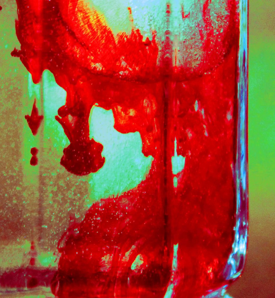
An ice cube causes convection of food dye in an alcohol water solution. Rubbing alcohol, so as not to waste scotch.
The write-up for this image can be found here.

By: Sean Harrison for Get Wet 2016
An ice cube causes convection of food dye in an alcohol water solution. Rubbing alcohol, so as not to waste scotch.
The write-up for this image can be found here.
21 Comments. Leave new
The red dye gives off the idea of blood and matching it with the yellow gives the image a very rustic feel. It does seem a little grainy but the ice and bubbles were a cool idea in making this great photo.
This photo has a nice artistic value. You did a really good job holding the flow as the artistic source of this photo. Nice technique, this would be really cool to do in a more clear container.
1. Extraordinarily dramatic – the red is fantastic. Artistically well composed and the yellow hued contrast provides an captivating mood to the image.
2. The flow is clearly revealed.
3. The photographic technique -especially the contrast and bold color is well done.
– Interesting contrast between the two red and yellowish colors.
– This reminds me of some sort of blood mixture in a TV show.
– The image is clear and the glare towards the right adds another interesting effect to the overall image.
The bright red streaking across the water-alcohol mixture gives the image a nice contrast. The flow is interesting to see how it behaves in this mixture due to the different densities. Good lighting!
It was very creative to use a mixture of isopropyl alcohol with water and an ice cube to create a unique flow visualization. The red color looks like a blood splatter dripping down the side of the glass. I also really like the background. The green to red fade in the background really make the red in the flow visualization pop out. Great image!
I like the red color of the food dye and the fact that you experimented with mixing liquids and including an ice cube. I think having a sharper focus would improve this photo, however. The addition of the alcohol may have contributed to lack of sharp lines, unfortunately.
I like the colors used, they work well together. The distortion is a little distracting (I can’t really tell if it’s bubbles, the glass, or both). Very cool phenomenon to explore.
I like the bubbles on the left side and how there are multiple fluid flows occuring. The image seems a bit grainy but it doesn’t take away from the images resemblance of blood.
I like the angle that this photo was captured at. Really makes the viewer curious as to what’s happening within the photo. The added red dye really helps bring out the flow of the alcohol mixing with the water.
Art: Looks like blood.
Flow: It’s almost as if the food dye sticks to the walls of the glass.
Photography: Good lighting.
I appreciate the inspiration behind the photo. There may be a little too many points fighting for your attention. I like the color contrast between the water/alcohol mixture and the dye.
I like the photo. It looks like you were far away when taking the photo and then cropped a lot of it out. It looks a little pixelly. Interesting to see the convection of the ice cube in the water.
The image is slightly grainy, A brighter, more white background could allow the die flow to pop out more. Great idea, pleasing photograph.
The red dye fluid is very interesting and I like how the red pops to a viewers eye. The image has good contrast and brightness. Maybe using different colored dyes would be an interesting addition.
Pleasing/effective colors. Flow is easily scene. Interesting to see the bubbles form as the ice is dropped in.
Art: The color contrast between the food dye and the alcohol is very dramatic and I love the mixing affects that you can see.
Flow: The flow is understandable and easily recognized.
Photographic technique: The focus on the dye is really well done and sharp. The lighting also improves the overall quality to this piece.
Art: the bubbles add a nice little wake.
Flow: Nice mix of alcohol with the food coloring. Very unique.
Photography: Maybe add a little more contrast.
1. Interesting bloody image! stunning color
2. the glass is a bit distracting
3. the flow interaction is clear
The red food coloring resembles blood. The alcohol makes a unique fluid flow on the interior of the container. The contrast between the dye and the bottle creates a powerful image.
-Really cool rustic looking color choices
-Great convection flow is clearly illustrated
-Interesting lighting, bright source behind looks nice