Report: Tianzhu Fan’s Report
Tianzhu Fan: Team First Hele-Shaw Cell
Categories
Search for content or authors
Flow Vis Guidebook
- Introduction to the Guidebook
- Overview 1: Phenomena. Why Does It Look Like That?
- Overview 2: Visualization Techniques
- Overview 3: Lighting
- Overview 4 - Photography A: Composition and Studio Workflow
- Overview 4 - Photography B: Cameras
- Overview 4 - Photography C: Lenses - Focal Length
- Overview 4 - Photography C: Lenses - Aperture and DOF
- Overview 4: Photography D: Exposure
- Overview 4 - Photography E - Resolution
- Overview 5 - Post-Processing
- Clouds 1: Names
- Clouds 2: Why Are There Clouds? Lift Mechanism 1: Instability
- Clouds 3: Skew - T and Instability
- Clouds 4: Clouds in Unstable Atmosphere
- Clouds 5: Lift Mechanism 2 - Orographics
- Clouds 6: Lift Mechanism 3 - Weather Systems
- Boundary Techniques - Introduction
- Dye Techniques 1 - Do Not Disturb
- Dye Techniques 2 - High Visibility
- Dye Techniques 3 - Light Emitting Fluids
- Refractive Index Techniques 1: Liquid Surfaces
- Refractive Index Techniques 2: Shadowgraphy and Schlieren
- Particles 1- Physics: Flow and Light
- Particles 2: Aerosols
- Particles 3: In Water
- Particles 4 -Dilute Particle Techniques
- Art and Science
- TOC and Zotpress test
- Photons, Wavelength and Color

20 Comments. Leave new
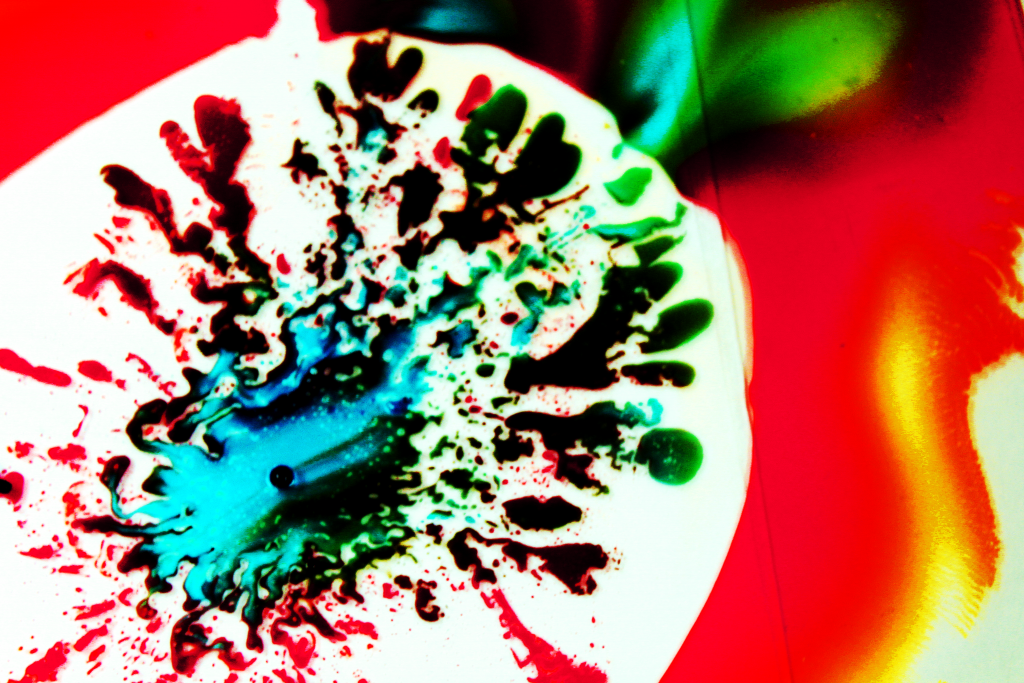
I like the splatter effect of the fluid flow. The colors are well contrasted with the background.
Cool experiment to sandwich the fluids with two pieces of glass. The water and the water-based food dye did not mix with the oil, creating really interesting finger-like limbs. I really like your color choices, looks like splattered tie dye. Your image has a larger contrast range from white to the dark greens and blues in the dye. Great work!
The black works really well with the light colors and white background. I like the details visible in the fingers. The image is a little grainy, but not so much that it bothers me.
Nice colors and patterns. Good job removing the background, I think it helps this image. To bad about the edge of the top sheet, it is a little distracting having that line on the right.
I like your photo, colors are beautiful! The border is nice. Photo is a little grainy. Overall you picked a great phenomena !
The image quality is vastly different than the image presented in class this may just be due to resolution/quality differences but may also be attributed to skewing of the aspect ratio during import. The vibrant colors and steep contrast helps to illustrate the effect very well.
I like the contrast of the dark colors next to the white. The line separating the top and bottom sheet is kind of distracting.
Focus is a little off, but your colors are very very striking. The red outline makes this very dramatic. Not sure about your post processing, seems like it made some of the colors appear black.
The flow is very well shown. The point of injection looks very cool!
I really like the color mixing the image. Nice work building the apparatus, really helped create a cool phenomena.
I like how your photo has a little bit of a 3rd dimensional aspect to it with the reflection on the fingers toward the bottom and toward the left.
Personally I like the black, I think you’ve done a great job highlighting the viscosity between the oil, dye, and water. Cool image!
Art: I really like the looks of the fingering in this one
Flow: Flow is clearly illustrated
Technique: Seems a little saturated or out of focus which gives it an abstract feel that I think works well
Good contract, you can see a range of colors from white to black. Like that you can see the larger and smaller markings.
I like how the center is off center for the photo. very nice work post processing to bring out the contrast. curious what the line running through the photo is?
I think the photo is a little bit out of focus but i like the vibrant colors and the use of the rule of thirds. Makes the photo very interesting and portrays a sense of movement. The colors are very interesting in this photo. Looks like some reflections and other things coming into play.
Image appears a little blurry, possibly increase shutter speed in the future. The dark spots really contrast well against the rest of the photo. The white-yellow piece off on the right is a bit distracting, maybe crop this out.
Very dramatic contrast. I like the features of black throughout the image. The hole where you injected the dye looks almost 3D.
Interesting image. the Physics is shown well. I’m not so sure about the black. Overall it looks good
I like the combination of very fine flow features as well as large ones. The high contrast of the image brings out the flow from the background.