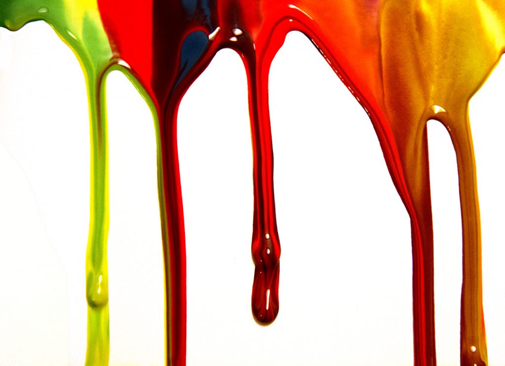
Dyed Oobleck with Food Coloring Dripping Down a Board, Creating a Stalactite Look.
Alex Thompson – Team First with Oobleck
Categories
Search for content or authors
Flow Vis Guidebook
- Introduction to the Guidebook
- Overview 1: Phenomena. Why Does It Look Like That?
- Overview 2: Visualization Techniques
- Overview 3: Lighting
- Overview 4 - Photography A: Composition and Studio Workflow
- Overview 4 - Photography B: Cameras
- Overview 4 - Photography C: Lenses - Focal Length
- Overview 4 - Photography C: Lenses - Aperture and DOF
- Overview 4: Photography D: Exposure
- Overview 4 - Photography E - Resolution
- Overview 5 - Post-Processing
- Clouds 1: Names
- Clouds 2: Why Are There Clouds? Lift Mechanism 1: Instability
- Clouds 3: Skew - T and Instability
- Clouds 4: Clouds in Unstable Atmosphere
- Clouds 5: Lift Mechanism 2 - Orographics
- Clouds 6: Lift Mechanism 3 - Weather Systems
- Boundary Techniques - Introduction
- Dye Techniques 1 - Do Not Disturb
- Dye Techniques 2 - High Visibility
- Dye Techniques 3 - Light Emitting Fluids
- Refractive Index Techniques 1: Liquid Surfaces
- Refractive Index Techniques 2: Shadowgraphy and Schlieren
- Particles 1- Physics: Flow and Light
- Particles 2: Aerosols
- Particles 3: In Water
- Particles 4 -Dilute Particle Techniques
- Art and Science
- TOC and Zotpress test
- Photons, Wavelength and Color

16 Comments. Leave new
Nice job removing the background in your image. The bifurcation of the different colors down multiple drip streaks is an interesting feature.
The 3D effect of the oobleck flow is well illustrated in the image. I also enjoy how the downward flows grab the little, isolated lines from the adjacent liquids ext to each flow line.
I like the color contrasts is great! I like the mixing of two colors! good focus
i really like how you can see the different colors and how you can see how the different properties in the colors act with each other as they drop down.
The white background makes the colors in this image pop. I like how the colors fade into one another in your streaks.
Love detail in the flow. The colors really pop. I like how you can see multiple lines of flow in the fluid where the colors began to mix together.
Love the variety of colors! Love the mixing you can see between them. The geometry in this is really cool. Image is beautifully clear and crisp. Love how glossy the fluid looks.
I really like the marbling effect of this photo. The consistency of the drip width is impressive. Good choice of vibrant colors in the photo.
Wow! Nice coloring, the blown out background is nice for contrast, but it kind of makes it hard to see the edges on the drip on the left. I like how you can see the lines of the darker and lighter streaks through the drips.
Stunning picture! You did a great job to white out the background and reveal only the oobleck flow, while keeping the 3D effect your teammates had. The way the colors mix in the top right is my favorite, it looks like gold leaf. That’s not an easy color to come by!
Art: The color contrast between the background and the fluid is amazing, the colors used in this piece are fantastic against the pure white background.
Flow: The flow is quickly understandable and recognized.
Photographic technique: The focus on the fluid is very well done especially with the bright lighting used.
i really like the colors that are in the photo. nice work with the background to make it all white. it is coo to see the mixing effect and the thickest of the flow on the board.
– Wow interesting set of colors!
– I like how there is a dark blue/black stream going down the red area.
– The mixing is well done in this and the background has a really nice white to it.
Wow! This image probably has the most diverse colors in your group. The contrast really brings out the definition of flow.
1. Wow!! Artistically extremely interesting and the contrast of the stark white background and fluid really works well.
2. The fluid is well shown.
3. The photographic technique is excellent and the focus is really sharp.
Strange string like shadow in left part of image distracts from flow, consider removing it. Contrast is excellent, image really pops. Center flows are very well focused, nice image.