Tiangen Ge: Team First
Categories
Search for content or authors
Flow Vis Guidebook
- Introduction to the Guidebook
- Overview 1: Phenomena. Why Does It Look Like That?
- Overview 2: Visualization Techniques
- Overview 3: Lighting
- Overview 4 - Photography A: Composition and Studio Workflow
- Overview 4 - Photography B: Cameras
- Overview 4 - Photography C: Lenses - Focal Length
- Overview 4 - Photography C: Lenses - Aperture and DOF
- Overview 4: Photography D: Exposure
- Overview 4 - Photography E - Resolution
- Overview 5 - Post-Processing
- Clouds 1: Names
- Clouds 2: Why Are There Clouds? Lift Mechanism 1: Instability
- Clouds 3: Skew - T and Instability
- Clouds 4: Clouds in Unstable Atmosphere
- Clouds 5: Lift Mechanism 2 - Orographics
- Clouds 6: Lift Mechanism 3 - Weather Systems
- Boundary Techniques - Introduction
- Dye Techniques 1 - Do Not Disturb
- Dye Techniques 2 - High Visibility
- Dye Techniques 3 - Light Emitting Fluids
- Refractive Index Techniques 1: Liquid Surfaces
- Refractive Index Techniques 2: Shadowgraphy and Schlieren
- Particles 1- Physics: Flow and Light
- Particles 2: Aerosols
- Particles 3: In Water
- Particles 4 -Dilute Particle Techniques
- Art and Science
- TOC and Zotpress test
- Photons, Wavelength and Color

19 Comments. Leave new
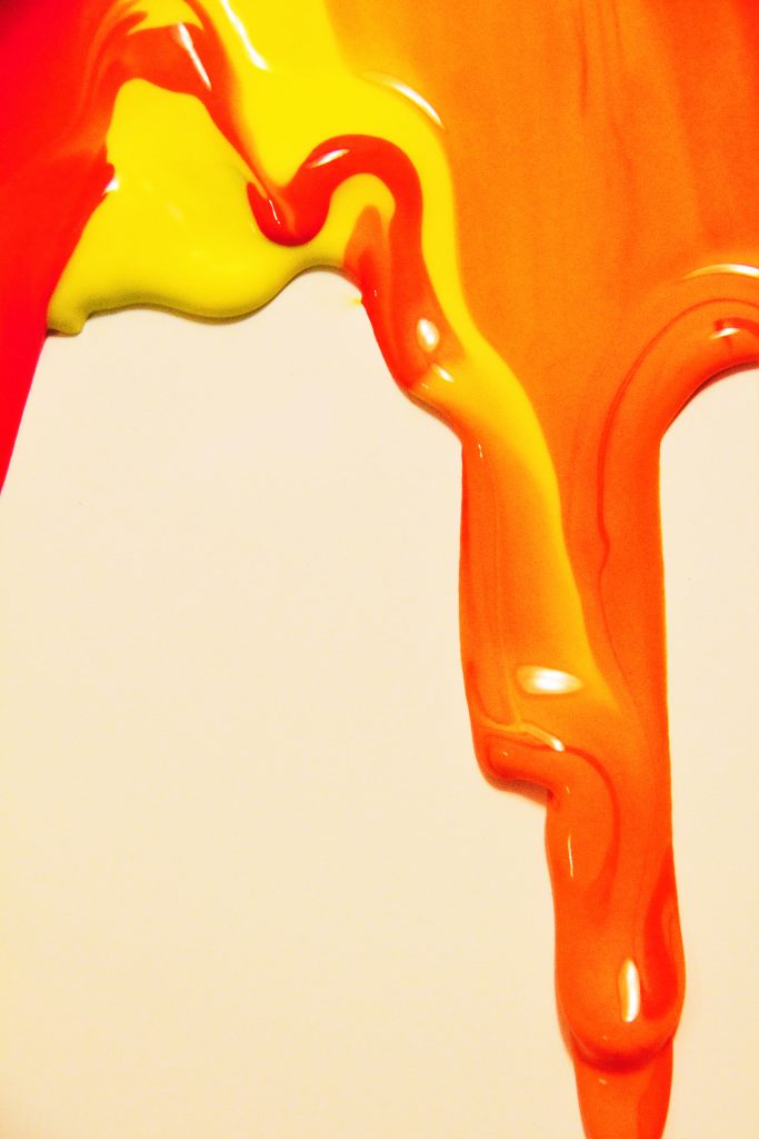
I like the range of warm tones in this image. A little more contrast with the background may have helped though. I’m also not sure in this tight crop where the subject is. Where should my eyes be drawn?
The flow of the red and yellow mixing is well visualized in the image. The color contrast and focus is sharp, think removing the flash reflections may add to the image.
Great editing; the aded gloss makes the whole image more interesting. I like how you’ve only included one fluid streak in the frame.
I like how you can see the two colors mix and the light reflections. The strong focus really makes the image pop and because of the great contrast against the background.
Great photo. I like the simplicity and lack of distractions in the picture. it really shows a good display of the mixing of the oobleck.
The focus of this image along with it’s vibrant colors make it pop. I like how you can see the different viscosities of each color as well.
I really like how you can see the color mixing in the fluid. The crisp line between the orange and the yellow and the red are nice. Clean crisp focus, nice clean background. Good representation of the fluid flow.
Make sure your post to flow vis has the highest resolution version, it is very grainy on the website right now. I do think you captured a cool effect with the coor interaction, the contrast between the neon yellow and the red that seems to be dominating the yellow. The photo also has a nice 3D effect.
– I like the bulbs on top of the already existing stream of the Oobleck flow.
– The green adds a nice contrast to the red streams.
i like how the color is mixing and how some spots are totally mixed and others are following a straight line in the flow. Cool to see the thickness of the drops on the board.
Awesome focus, you achieve your goal of making the surface glossy, I like how you illustrate the mixing of the two colors and the interactions between the oobleck.
Nice capture of flow slowly moving down. This image is very sharp and the colors are very vivid. I really like the mixing of the two colors.
Art: The color contrast between the fluid and the white background is great.
Flow: The flow is quickly understandable and recognized.
Photographic technique: The focus on the fluid is very well and the lighting that was used in this piece is also great.
Love how you focused on one drip and really showed the colors mixing. Love the shiny glossy surface of oobleck. The photo is really crisp and clear.
Amazing display of fluid flow. The color choices contrast well with each other and reflects the current fall season.
Possibly consider posting a slightly higher quality jpeg to the website, it’s pixelating a fair amount at standard size. Nice contrast between background and flow. The multiple vibrant colors really make this image pop and make me think of fire.
1. Artistically interesting image and the composition is very nice.
2. The fluid is well shown.
3. The photographic technique is very good and the vibrant colors are well detailed.
Great color contrast and lighting. You could make the background whiter. I like the reflections.
The image pops with color. I like how you can see the multiple layers to the flow on the right side of the image.