Team Second – Joseph Hall
Categories
Search for content or authors
Flow Vis Guidebook
- Introduction to the Guidebook
- Overview 1: Phenomena. Why Does It Look Like That?
- Overview 2: Visualization Techniques
- Overview 3: Lighting
- Overview 4 - Photography A: Composition and Studio Workflow
- Overview 4 - Photography B: Cameras
- Overview 4 - Photography C: Lenses - Focal Length
- Overview 4 - Photography C: Lenses - Aperture and DOF
- Overview 4: Photography D: Exposure
- Overview 4 - Photography E - Resolution
- Overview 5 - Post-Processing
- Clouds 1: Names
- Clouds 2: Why Are There Clouds? Lift Mechanism 1: Instability
- Clouds 3: Skew - T and Instability
- Clouds 4: Clouds in Unstable Atmosphere
- Clouds 5: Lift Mechanism 2 - Orographics
- Clouds 6: Lift Mechanism 3 - Weather Systems
- Boundary Techniques - Introduction
- Dye Techniques 1 - Do Not Disturb
- Dye Techniques 2 - High Visibility
- Dye Techniques 3 - Light Emitting Fluids
- Refractive Index Techniques 1: Liquid Surfaces
- Refractive Index Techniques 2: Shadowgraphy and Schlieren
- Particles 1- Physics: Flow and Light
- Particles 2: Aerosols
- Particles 3: In Water
- Particles 4 -Dilute Particle Techniques
- Art and Science
- TOC and Zotpress test
- Photons, Wavelength and Color

12 Comments. Leave new
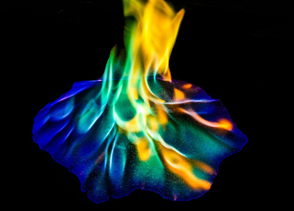
The sparkles under the flame really make the image I think. I love the different interactions of the colors. I think because of the sparkles, I don’t mind that the image is a little grainy. It adds to it, really.
The green and blue flame makes a really interesting photo. The spots on the concrete also add an interesting element to the image. I do find myself wanting to see the top of the flame. A portrait orientation may have helped with that. Saturation was also taken a little too far for my taste.
Very cool colors i this photo. The methyl alcohol creates a really fascinating color contrast with the blue and orange. Great job getting the colors to pop in post processing
This fire is almost like an image of an explosion off of an alien spaceship. I love it. The color spectrum was optimized to its fullest extent here, and I cannot see why you would not use it. If anything, I would have liked to see a few more colors get used. Red is the contrast of green and helps make it pop and vise versa. With that said, there is a bit too much green, but this is only a minor suggestion for improvement. One thing I notice is the fire is cropped a bit at the top. I don’t know if you managed to capture the tip, but I would love to see if all the colors managed to converge at it if you did manage to capture it. The artistic merit is, from what I see, is how the flame is centered and in full blast coverage of where it should be. Nicely done.
You’ve simply outdone yourself with this one, beautiful colors and a crisp sharp focus. Well done
Even though you lost a little resolution in editing I like how vibrant the colors are in your image. The sparkles on the ground are gorgeous and if you couldn’t see the rest of the flame it would look like a picture of the night sky.
Nice clean crisp photo. I like the colors, the sparkle, and the contrast. Perhaps your shutter speed could have been a liiiittle bit faster.
Beautiful colors. Great contrast. Nice post processing done to the image. I like the texture of speckles at the bottom. No distracting elements.
The colors in the flame are awesome. The image is super cool and the flame is well focused.
Vivid color!! love the contrast. The focus could be slightly better.
Great focus at the base of the flame. The upper flame is slightly blurry though. Great colors and contrast in this photo
I really like the intricate colors of of the flame. The contrast between the colors in the flame is unique to really see how everything interacts. I like the little sparkles on the ground as well, adds to the texture of the photo.