Yadira Valadez – Team Second
Categories
Search for content or authors
Flow Vis Guidebook
- Introduction to the Guidebook
- Overview 1: Phenomena. Why Does It Look Like That?
- Overview 2: Visualization Techniques
- Overview 3: Lighting
- Overview 4 - Photography A: Composition and Studio Workflow
- Overview 4 - Photography B: Cameras
- Overview 4 - Photography C: Lenses - Focal Length
- Overview 4 - Photography C: Lenses - Aperture and DOF
- Overview 4: Photography D: Exposure
- Overview 4 - Photography E - Resolution
- Overview 5 - Post-Processing
- Clouds 1: Names
- Clouds 2: Why Are There Clouds? Lift Mechanism 1: Instability
- Clouds 3: Skew - T and Instability
- Clouds 4: Clouds in Unstable Atmosphere
- Clouds 5: Lift Mechanism 2 - Orographics
- Clouds 6: Lift Mechanism 3 - Weather Systems
- Boundary Techniques - Introduction
- Dye Techniques 1 - Do Not Disturb
- Dye Techniques 2 - High Visibility
- Dye Techniques 3 - Light Emitting Fluids
- Refractive Index Techniques 1: Liquid Surfaces
- Refractive Index Techniques 2: Shadowgraphy and Schlieren
- Particles 1- Physics: Flow and Light
- Particles 2: Aerosols
- Particles 3: In Water
- Particles 4 -Dilute Particle Techniques
- Art and Science
- TOC and Zotpress test
- Photons, Wavelength and Color

20 Comments. Leave new
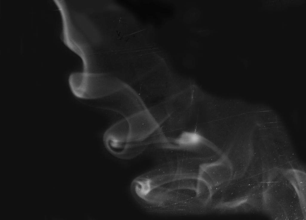
This is really cool; it looks like a photograph from 100 years ago. The scratches and soft resolution give a really nostalgic feel. The contrast between the black and white is really nice.
Art: The contrast between the background and the smoke is good, but the scratches are a bit distracting from the overall process.
Flow: The flow is quickly understandable and recognized.
Photographic technique: The focus and the use of post processing to rotate this picture is great.
The shapes in the smoke are really cool. It’s too bad the scratches, background and lack of focus detract from what was otherwise a cool photo.
Despite the obvious criticism of it not being in focus, I do like the shape and form of this image. Its grainy feel is akin to an early twentieth-century movie. The micro swirls towards the bottom right are appealing to the eye, and the fact that the swirls grow from right to left emphasize how the smoke is either growing or shrinking. I’m curious as to why you chose white. Don’t get me wrong, white goes well with black always, but I am a bit curious.
Flipping the image upside down was interesting. The scratches don’t necessarily take away from the image but just changes the feel of it.
1. The image is artistic and flipping the image is a great touch.
2. The fluid physics are well shown.
3. The photographic technique is good.
I like the flipped version of smoke, and it seems like it was the smoke is slightly out of focus. I always enjoy the black and white smoke images
I realize the scratchy background was not intentional and now you know how to get rid of them if you preferred to do so next time. However, you could use this effect intentionally if you wanted to pull a texture into the smoke plume.
Great effect captured! Good decisions editing, though the scratched background is a bit distracting. Did you consider back-lighting? Focus could be a shade better, but doesn’t really detract from the image overall.
I really like how you image looks aged. i agree that the scratches add to the feel of the photo and give it some old school feel.
The cracks in the image give it a rather interesting feel. The smoke contrasts nicely on the background. The smoke is clearly focused and the swirls are nice.
Good contrast. I like the roll up! the scratches are a bit distracting.
Nice black and white image. The scratches can be a little distracting but give the image some more texture. Cool how they are only in the areas with the flow.
Seems like the your camera was forced on the background and not the flow itself. This may be due to using autofocus as opposed to manual focus. The scratches do look like an antique looking photo which is cool.
Nice photo, the smoke is beautiful. The focus seems a little bit off, the scratches in the background are a nice texture, I don’t think they’re too distracting.
The focus could be a little more crisp, and that might eliminate some of the scratch lines in the background of the image. The effect itself is really interesting!
WOW this photo is actually super cool! I like the bottom right side where is makes it look like a very old photo! The focus on the flow is a little bit off but creating that effect was really cool!
Nice capture of smoke plume. I really like the black and white look of the image and the flow phenomena is clearly visible.
The scratches I actually kinda like. makes the photo look like one of those old school film photos that’s been aorund forever. Like prof. hertzberg said, your focus is off. other than that, nice job!
I like the contrast of the image as well as the black and white effect. The flow can be clearly seen in this image as well. The focus is a little soft though and should be focused better to have a crisp image.