Branden’s Photo Report: teamsecondreport
Branden Goldenberg – 2016 Team 2nd Image
Categories
Flow Vis Guidebook
- Introduction to the Guidebook
- Overview 1: Phenomena. Why Does It Look Like That?
- Overview 2: Visualization Techniques
- Overview 3: Lighting
- Overview 4 - Photography A: Composition and Studio Workflow
- Overview 4 - Photography B: Cameras
- Overview 4 - Photography C: Lenses - Focal Length
- Overview 4 - Photography C: Lenses - Aperture and DOF
- Overview 4: Photography D: Exposure
- Overview 4 - Photography E - Resolution
- Overview 5 - Post-Processing
- Clouds 1: Names
- Clouds 2: Why Are There Clouds? Lift Mechanism 1: Instability
- Clouds 3: Skew - T and Instability
- Clouds 4: Clouds in Unstable Atmosphere
- Clouds 5: Lift Mechanism 2 - Orographics
- Clouds 6: Lift Mechanism 3 - Weather Systems
- Boundary Techniques - Introduction
- Dye Techniques 1 - Do Not Disturb
- Dye Techniques 2 - High Visibility
- Dye Techniques 3 - Light Emitting Fluids
- Refractive Index Techniques 1: Liquid Surfaces
- Refractive Index Techniques 2: Shadowgraphy and Schlieren
- Particles 1- Physics: Flow and Light
- Particles 2: Aerosols
- Particles 3: In Water
- Particles 4 -Dilute Particle Techniques
- Art and Science
- TOC and Zotpress test
- Photons, Wavelength and Color


18 Comments. Leave new
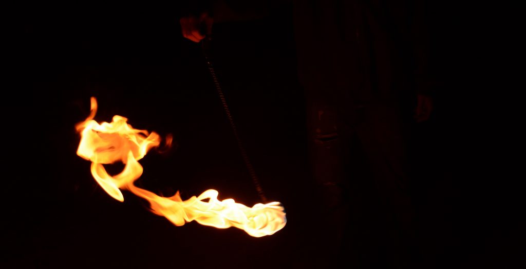
I like the colors of this image a lot. Also, I appreciate that the background wasn’t totally blacked out. This give the image context and makes it feel more real, if that makes sense. Nice job.
Very cool photo. kinda weird comment, has a very satanic vibe to it. I wish the photo on the website was a little better quality. Hard to really appreciate what is going on.
Art: The contrast between the background and the fluid is really well done, there is some background distraction.
Flow: The flow is quickly understandable and recognized.
Photographic technique: The depth of field used is well done.
Good work team!
Cool shapes in the flames near the tailing edge of the streak. You should try to get a different version of the image uploaded that doesn’t come out blurry on the website.
Really nice photo. Color of fire is very vibrant and the flow pattern is clearly visible. Creative apparatus used to capture this image.
Quality is a little low but still enjoy the image. Love seeing how fire flows. Interesting shape that occurred on the left of the flow.
Cool effect, but I think a lot is left to be desired. The flame itself is a bit bright, and seems to lose some detail. The background is a bit distracting. The person is in an awkward amount of light, enough to be noticed but not enough to be defined. I would like to see either a clean background, or one where the person is a definite part of the image. Really neat effect captured, but some colour correction and editing would REALLY help this image.
Wow, the contrast is amazing and the fluid flow is clearly seen. I like how the fire forms a crisp ball
This usage of fire looks awesome and the movement of the fire from left to right is easy on the eyes and very appealing. I can see this being a video in slow motion, but an image works just as well. This is the type of fire imagery that I hope to achieve someday, and I can tell that capturing it in one shot after doing multiple takes is not an easy task. With that said, I enjoy the flow of the fire, but it seems just a bit too far from the camera. But this is only a slight nitpick. If you add just a bit more color in post, I could see this being a highly featured image that you may want to submit. Nice job.
I’m a sucker for images of flames, and this shows a great flame image. I think it might be worth trying to edit your hand out of the photo though.
Lovely image. I with the focus was a little sharper but the dynamics of the flame in pendulum motion are visually stunning
The image could use some higher quality. It’s always interesting to see the fire take on its shape.
Art: Awesome contrast between the background and the fire
Flow: Flow is clearly illustrated
Technique: The focus looks good before the image is blown up so I think thats just a problem with the sizing on the website
Coming off Halloween my mind is still there and the fire resembles a chainsaw shape to me. The spot above the fire is a little distracting to me and could be removed. I enjoy the contrast of the fire to the black background.
Posted image quality seems a little low, possibly compress the posted image a little less next time. Focus on the fire is good, and contrast with nighttime is excellent. Although there is one stray light towards the top, consider editing that out.
Nice photo, you can really see the fluid flowing, the contrast between flame and background is nice. Cool capturing of this fire ring.
I like the tail of the photo. really cool to see how the fire follows the trajectory through the air. would be nice to see it in full resolution but nonetheless nice work