Tianzhu Fan-Team third
Categories
Flow Vis Guidebook
- Introduction to the Guidebook
- Overview 1: Phenomena. Why Does It Look Like That?
- Overview 2: Visualization Techniques
- Overview 3: Lighting
- Overview 4 - Photography A: Composition and Studio Workflow
- Overview 4 - Photography B: Cameras
- Overview 4 - Photography C: Lenses - Focal Length
- Overview 4 - Photography C: Lenses - Aperture and DOF
- Overview 4: Photography D: Exposure
- Overview 4 - Photography E - Resolution
- Overview 5 - Post-Processing
- Clouds 1: Names
- Clouds 2: Why Are There Clouds? Lift Mechanism 1: Instability
- Clouds 3: Skew - T and Instability
- Clouds 4: Clouds in Unstable Atmosphere
- Clouds 5: Lift Mechanism 2 - Orographics
- Clouds 6: Lift Mechanism 3 - Weather Systems
- Boundary Techniques - Introduction
- Dye Techniques 1 - Do Not Disturb
- Dye Techniques 2 - High Visibility
- Dye Techniques 3 - Light Emitting Fluids
- Refractive Index Techniques 1: Liquid Surfaces
- Refractive Index Techniques 2: Shadowgraphy and Schlieren
- Particles 1- Physics: Flow and Light
- Particles 2: Aerosols
- Particles 3: In Water
- Particles 4 -Dilute Particle Techniques
- Art and Science
- TOC and Zotpress test
- Photons, Wavelength and Color


14 Comments. Leave new
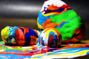
The depth of field in this image is really cool. I think it really adds to the complexity of the image. THe colors are great aswell
Excellent colors, the use of these bright paints really helps the image to pop. The background is a little distracting away from the colors. The focus fade at the bottom of the image adds a nice effect.
This image is absolutely awesome, and I love the use of blending here. Each color is distinct in its own right, and they all blend in a way that feels natural, unique, and fun. I can tell that some good preparation was used to make this image pop out and stand on its own legs. With that said, I am eager to see if you can produce more images like this. Nice job. Definitely one of the best images for this project so far.
Wow! Paint over rocks really help visualize the fluid flow. The paint doesn’t mix together well and makes the image more visually pleasing.
Beautiful color and focus. I love the idea of the rocks. Great job
Was the difference in focus between the two rocks in the foreground vs the third rock further back, the intent of the image? I especially enjoy how this image showcases the vertical to horizontal transition from the bottom the rocks onto the surface of the table. The stripes in the background are a little distracting, but only in my opinion. Very fun image overall!
The different colors on the irregular surfaces make a neat flow. There are tons of colors and it really makes you analyze the entire image.
Awesome concept; I love how the patterns in the are continuous between the rocks and the ground.
Spectacular use of depth of field here! The colours are really great and show the interactions between the layers of paints. Well lit. Nice work!
The addition of the rocks gives a nice texture to the photo. I love the mixing shown here. Nicely done.
1. Great artistic image with lovely, vibrant colors.
2. The fluid physics are well shown.
3. The photographic technique is well done.
This image reminds me of some of the work done by Gaudi in Barcelona with all of the colors. cool to see where the paint has flowed from the initial contact point.
Fantastic use of colors! They are very vibrant and the mixing between all of them is very interesting and detailed.
Great depth of field! Deep enough to show the colors, but shallow enough to give some drama to the photo. You guys did a great job of getting the many colors not to mix, but be distinct on their own.