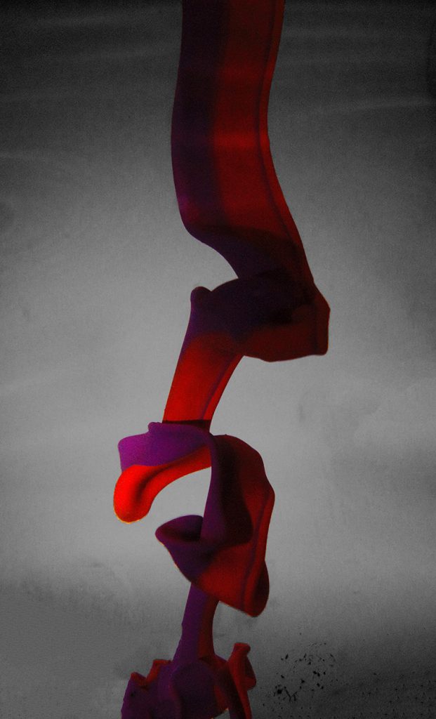
Two different latex paints poured in a tank of tap water look like a fruit roll-up falling before dissolving.
Alex Thompson – Latex Paint in a Fish Tank of Water
Categories
Search for content or authors
Flow Vis Guidebook
- Introduction to the Guidebook
- Overview 1: Phenomena. Why Does It Look Like That?
- Overview 2: Visualization Techniques
- Overview 3: Lighting
- Overview 4 - Photography A: Composition and Studio Workflow
- Overview 4 - Photography B: Cameras
- Overview 4 - Photography C: Lenses - Focal Length
- Overview 4 - Photography C: Lenses - Aperture and DOF
- Overview 4: Photography D: Exposure
- Overview 4 - Photography E - Resolution
- Overview 5 - Post-Processing
- Clouds 1: Names
- Clouds 2: Why Are There Clouds? Lift Mechanism 1: Instability
- Clouds 3: Skew - T and Instability
- Clouds 4: Clouds in Unstable Atmosphere
- Clouds 5: Lift Mechanism 2 - Orographics
- Clouds 6: Lift Mechanism 3 - Weather Systems
- Boundary Techniques - Introduction
- Dye Techniques 1 - Do Not Disturb
- Dye Techniques 2 - High Visibility
- Dye Techniques 3 - Light Emitting Fluids
- Refractive Index Techniques 1: Liquid Surfaces
- Refractive Index Techniques 2: Shadowgraphy and Schlieren
- Particles 1- Physics: Flow and Light
- Particles 2: Aerosols
- Particles 3: In Water
- Particles 4 -Dilute Particle Techniques
- Art and Science
- TOC and Zotpress test
- Photons, Wavelength and Color

18 Comments. Leave new
Great visualization of the paint. Great fluid flow such that it resembles a ribbon. Well done.
This image makes me think of peppermint candy ribbon, really cool shot. However, you might not want to crop it so high, because the eyes get drawn below the edge of the image. Also there are some black dots in the lower right of the image you might want to consider removing in post processing.
Great job highlighting the roll-up with the illumination.
The appearance of this image is similar to that of a ribbon. The hue and flow feels natural and unique. With that said, I am intrigued by how you were able to capture the image in such a crisp and natural form. The artistic merit is similar to that of a twentieth century painting from France. I love seeing photos with backgrounds that compliment the image and give it a zesty surreal look. I will see if I can find the photo of the ribbon that this is reminding me of, but itmay be hard to find.
Very crisp image with great focus. The silky smooth paint looks very nice. Great job on the ribbon.
cool picture! I like how the two colors of the ribbons sort of fold over each other especially over the parts where the paint folds over one another.
I really like the ribbon-like quality of the paint as it folds up as it descends. Lighting really puts the focus right in the middle of the image, very nicely done.
The flow is very interesting to see! The image could be brightened a little more in order to see the “ribbon” more clearly.
Cool image!! I like the contrast. I wish it was a bit brighter
Very cool shape formed by the paint folding over itself. Love the purple and red color interaction. I think this would look better if it was better illuminated, but I can understand the vignette effect too. Great quality and focus.
It’s a very unique image, without explanation it would have been very difficult to understand what is going on, 8 like the colors, it looks like ribbon good work.
The image is rather grainy and a couple spots are hard to see the shadows, but I love the concept and colors. Your focus is great which makes the photo even more interesting.
Very cool formation of the latex paint in the water. Great color and contrast. Awesome job!
I really like the ribbon effect of this photo! The colors are super cool.
I really like the way that the paint folds over on itself in the image, this is really cool. interesting how the colors overlap when falling through the water.
Very interesting ribbon effect shown. The colors are really nice, image could be a bit brighter and would look more professional with a bright white background.
– Interesting photo, I like the color combination, it does look like a fruit roll-up.
– The little black/grey bits in the bottom right are a little bit distracting.
– I do like the gradient background it makes the colors pop.
Nice ribbon! Beautiful lighting, good coloring. Nice!