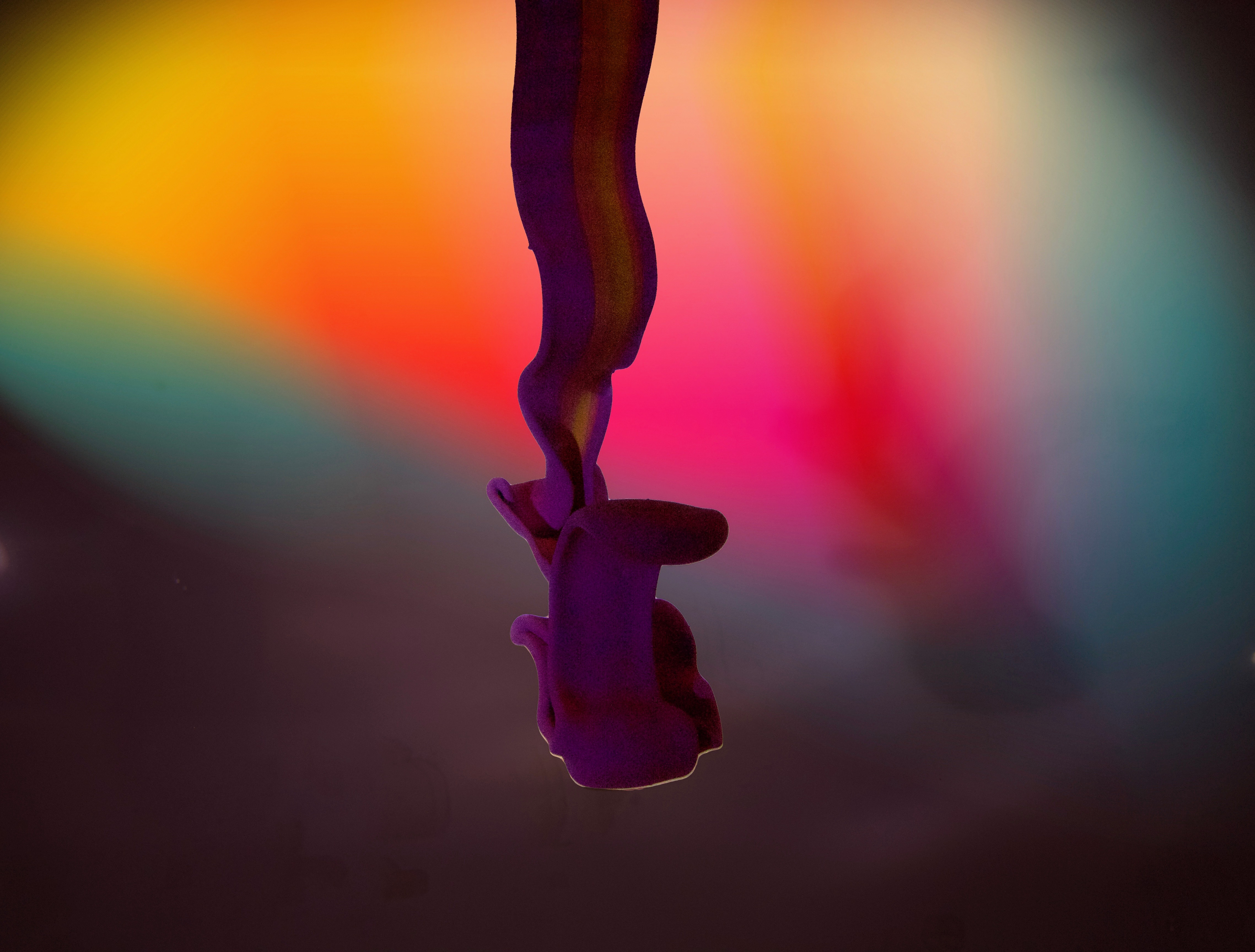
Latex paint in a fish tank.
Tiangen Ge Team Third
Categories
Flow Vis Guidebook
- Introduction to the Guidebook
- Overview 1: Phenomena. Why Does It Look Like That?
- Overview 2: Visualization Techniques
- Overview 3: Lighting
- Overview 4 - Photography A: Composition and Studio Workflow
- Overview 4 - Photography B: Cameras
- Overview 4 - Photography C: Lenses - Focal Length
- Overview 4 - Photography C: Lenses - Aperture and DOF
- Overview 4: Photography D: Exposure
- Overview 4 - Photography E - Resolution
- Overview 5 - Post-Processing
- Clouds 1: Names
- Clouds 2: Why Are There Clouds? Lift Mechanism 1: Instability
- Clouds 3: Skew - T and Instability
- Clouds 4: Clouds in Unstable Atmosphere
- Clouds 5: Lift Mechanism 2 - Orographics
- Clouds 6: Lift Mechanism 3 - Weather Systems
- Boundary Techniques - Introduction
- Dye Techniques 1 - Do Not Disturb
- Dye Techniques 2 - High Visibility
- Dye Techniques 3 - Light Emitting Fluids
- Refractive Index Techniques 1: Liquid Surfaces
- Refractive Index Techniques 2: Shadowgraphy and Schlieren
- Particles 1- Physics: Flow and Light
- Particles 2: Aerosols
- Particles 3: In Water
- Particles 4 -Dilute Particle Techniques
- Art and Science
- TOC and Zotpress test
- Photons, Wavelength and Color


20 Comments. Leave new
I really like the mushroom like effect of the paint. The lighting is a little poor, however, the flow can still be clearly seen. Very aesthetically pleasing.
Beautifully focused image, the pain is so crisp. The colorful background adds nicely to the image. The texture on the paint is excellent, well done.
You did a good job pulling the surface effects of the latex paint from the original image. I am pleased to see the creative background you added, it adds to the image’s overall quality.
Once again, this image is enhanced by the background and draws out the color of its formation. With the formation itself, I almost wish I could see a bit more of it. The capture of the paint as it spirals down through the water is quite a feast for the eyes. The merit of this image comes from its use of color in a very royal and peaceful way. This image is well done and I can see that there was caution when taking the image since a long shutter speed is needed for fluids that are moving out of frame at a good rate. Nicely done.
Nice job enhancing the shape of the negatively buoyant plume with your editing and coloration of the background.
Great job on the post processing to bring out the colors in the paint. I really enjoy the background and the rainbow effect, however it is taking over the image. If possible to tone down the background, and bring up the fluid. Nice ribbon.
great photo! I can tell there was a lot of post processing work done to the photo when you see the original. I think the background is slightly distracting, however the paint looks very sharp and has good contrast.
Very beautiful photo! Focus is very sharp, but the photo still has a beautiful cartoonish feel. I like the decision to put the bright colors in the background. Amazing post-processing job.
Nice editing to the background. Good color throughout the image. Big difference from your original photo.
I really like the foreground and background colours. The paint ribbon provides the action for the photo, while the colored background adds a nice element. Great job post processing, the changes really make the image pop!
really excellent work in editing the photo. I like the colors in the background and the way that the purple colors of the falling paint. super cool photo.
Wow! Nice photo! Good clear focus. It really looks frozen in space. Nice post processing!
I like how your post processing makes the paint looks like it is dangling in mid air. The background colors help complement the paint colors, but I think the ribbon could still use a little brightening.
Very awesome photo, the colors displayed in this image are very unique. The editing done really brings out the colors and brightness compared to the original photo.
I like how the background really highlights the flow despite the flow not being as bright. A very unique way to clearly show the paint.
Whoa the colored background is pretty awesome. By far the most impressive thing about this is how much detail you got out of this photo from the original. Impressive!
WOW love the lighting and focus. I like what you did with the background in post editing
Your focus is incredible, I really enjoy the backdrop, your editing is superb and you have really brought to life a bland picture. Great work!
I really like the background, as it fills the entire frame. I like the illumination on the bottom of the ribbon.
– Sweet photo, the focus is very clear on the flow and the background has a nice sunset/pastel feel to it I really like this.