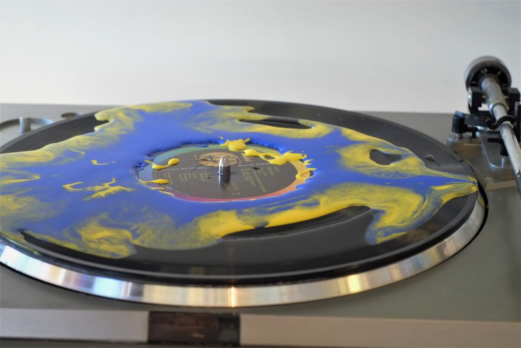
Oobleck was mixed twice with yellow and blue painter’s pigment then drizzled onto the centered colored ring of the record on a rotating turntable. The fluid dispersed to the outer rings of the record as the oobleck that remained on the inner rings solidified.
Team First – Brandon
Categories
Flow Vis Guidebook
- Introduction to the Guidebook
- Overview 1: Phenomena. Why Does It Look Like That?
- Overview 2: Visualization Techniques
- Overview 3: Lighting
- Overview 4 - Photography A: Composition and Studio Workflow
- Overview 4 - Photography B: Cameras
- Overview 4 - Photography C: Lenses - Focal Length
- Overview 4 - Photography C: Lenses - Aperture and DOF
- Overview 4: Photography D: Exposure
- Overview 4 - Photography E - Resolution
- Overview 5 - Post-Processing
- Clouds 1: Names
- Clouds 2: Why Are There Clouds? Lift Mechanism 1: Instability
- Clouds 3: Skew - T and Instability
- Clouds 4: Clouds in Unstable Atmosphere
- Clouds 5: Lift Mechanism 2 - Orographics
- Clouds 6: Lift Mechanism 3 - Weather Systems
- Boundary Techniques - Introduction
- Dye Techniques 1 - Do Not Disturb
- Dye Techniques 2 - High Visibility
- Dye Techniques 3 - Light Emitting Fluids
- Refractive Index Techniques 1: Liquid Surfaces
- Refractive Index Techniques 2: Shadowgraphy and Schlieren
- Particles 1- Physics: Flow and Light
- Particles 2: Aerosols
- Particles 3: In Water
- Particles 4 -Dilute Particle Techniques
- Art and Science
- TOC and Zotpress test
- Photons, Wavelength and Color


32 Comments. Leave new
Nice color and framing, however, the focus could be improved.
Just as in the other photos, I love the mix of the yellow and blue. I like how you shot the photo at a nice angle away from the record player, it leaves you wondering and searching for more inside the flow. I like how the paints are in the middle of their mixing and you can see how they are interacting
I think this photo could be better if the image had a better resolution. Exposure could be a little brighter, but it is good enough to see the photo. I love the marbleization of the blue and yellow on the record.
The depth of field is good and I like how the colors are mixing together on the record. The flow looks really cool. Maybe next time center the turntable.
I love the depth of field in this image. It is weird how the colors have mixed by now.
I wonder what the needle would do to the distribution of the oobleck if you played the record? What would it sound like?
I think the angle of the photo is interesting and adds value to the photo. The cookies swirling seem a little too mixed at this point if the photo.
The angle of this image really stands out. It gives the fluid some thickness, which is really interesting to look at.
A very beautiful image. I like the colors, the focus and frame are good!
The colors are really nice together. I like the fluid flow and how it runs together.
The flow looks a little messy, and maybe center the flow in the image more?
wow! the texture of the flow is really visible and interesting in this image.
… you’re just a pour boy, from a pour famileeee
Love the framing of this image and the soft light in the background.
I like this image was taken once the oobleck mixec around a little more. Nice focus and shot.
It is cool to see the different perspectives of this. The clear focus with a slight blur around the edges pulls the focus to the flow.
Really interesting color combination! I like the different flows.
Color combination is great, record could be framed more toward the center of the image, the depth of field is nice and draws the eye toward the center of the image.
The blue and yellow colors mixed together makes for an appealing image. The experiment was very interesting and original. Did you make any edits to the photo in Photoshop?
Interesting flow. I like how the colors mix. The focus seems to be on the center of the turn table, but there is no flow there. The image is cut off on the left
This shallow view is interesting, the 3D effect is very interesting
Cool colors and the focus is not bad. I think the depth of field could be increased but keep the focus on the center of the record
This is a great angle. I love the colors and the splattering in the center.
Great choice of angling the image so that the depth of field stands out and brings out the center of the subject.
I am a fan of the depth of field effect. Again the colors are excellent.
I like the angle on this one, and the way you composite this image , I like the big aperture you choose.
I think this perspective is effective. I wonder if a larger depth of field would resolve the flow more.
Cool image, its cool to see the fluids mix when they stop. Nice color and exposure in image, not much I’d change.
Interesting effect. Perhaps increase depth-of-field for next time.
I like the view in this image. I like how the center most part is the most focused part. Good lighting and colors as well.
Wow great image! Absolutely gorgeous! You have a great skill!
I like the angle that you took this at. It is a good change from the images straight from the top.
I like the flow of the ooblek on the record. You can really see the mixing of the liquid on the disc. The could be improved, but the colors are great. Nice job!
I like the use of opposite colors in the oobleck, it really highlights the flow. There are interesting flow dynamics but overall is a really dynamic image. You might want to increase the image size of your posting, it is a little less vibrant and clear than the image shown in class.
Again, I like the mixing of the 2 colors. The focus is a bit off but I really like the reflections off the paint.