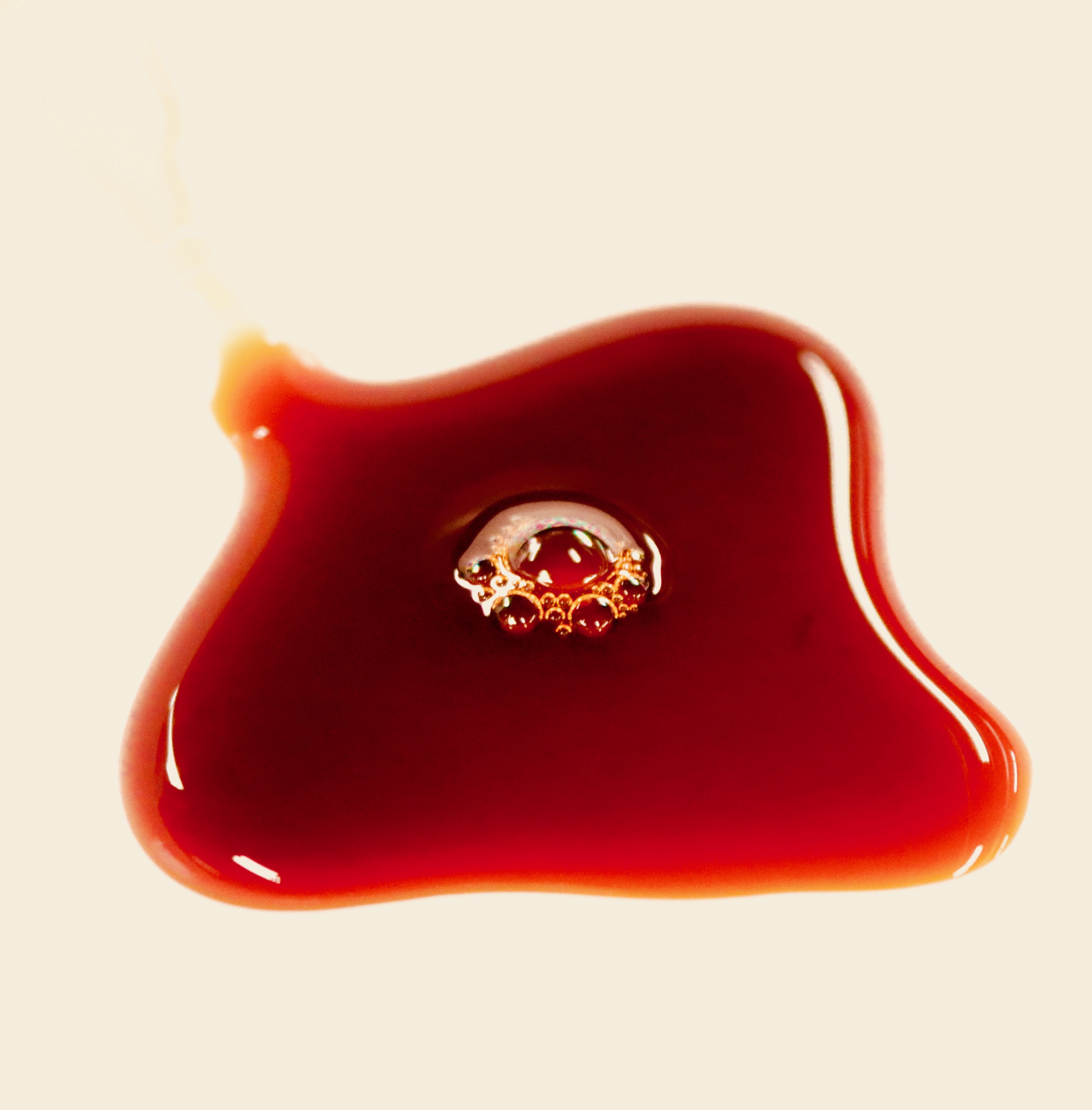
Kimlan soy with aerated bubbling forming at the center of the clover.
Report Link: https://docs.google.com/document/d/1N7oyqcO8H0FGZ_Stf8bU4jO9hMpdgquNeTsVg5nMCbI/edit?usp=sharing

Kimlan soy with aerated bubbling forming at the center of the clover.
Report Link: https://docs.google.com/document/d/1N7oyqcO8H0FGZ_Stf8bU4jO9hMpdgquNeTsVg5nMCbI/edit?usp=sharing

49 Comments. Leave new
I wonder what instability caused this shape. Really nice framing, focus and lighting.
Art: Radiant photo. The bubbles sit perfectly in the middle. It looks like a scary spider trying to pop out of the liquid.
Flow: There doesn’t seem to be much flow in the photo itself, but I do like how the flow used created the picture.
Technique: Great focus, and use of adjusting colors to get rid of the tail end up above the puddle.
Art: Beautifully centered image.
Flow: Good, wish you had the drip it came from.
Technique: Good. Nice editing.
I think the bubbles on the middle were very interesting. The fact that it was a creative flow that no one expected was very interesting.
Art : simple and elegant
Flow : The flow of soy sauce is stopped moving
Tech : Nice color contrast!
The contrast is really cool. The reflection around the edges that shows the surface tension is really cool. The bubbles in the middle are a nice effect. The tail where it was poured could maybe be eliminated by dropping the sauce instead of pouring it. The rest of the image is so clear and crisp. I would hang this one on my wall.
Very nice picture. The setup was simple yet created such a nice image. The editing is phenomenal I like the contrast.
Picture contrast is phenomenal as well as the texture from the bubbles in the middle. Great picture
The soy sauce has a really cool red glow to its outline. The bubbles look fractal-like. Very simple.
I really like the simple contrast in this image. The focus is done well and I am drawn to the innocent bubbles forming in the middle.
Lighting and color is really nice. I also enjoy the clustered bubbles in the middle.
The contrast between the soy sauce and the paper plate is really cool as well as the bubbles in the middle of the liquid. The flow of the original image is also very cool with the soy sauce spilling down the side.
Awesome setup, the contrast and colors are definitely unique. After seeing the original image I noticed that the original had more defined edges from the red to white. I liked that defined line and feel like you could reduce that a bit.
I like the exposure and focus of this image- very clean!
I would actually love to see more light refraction in the liquid as well.
The red on white contrast is really appealing. The bubbles in the center make the picture more interesting. There is some dispersion on the top of the bubbles which make them stand out more. If there were a mix of colors, the picture would pop more, but overall good picture.
I like the way you compose the image, great contrast between the soy source and the white plate. Interesting to the the bubbles in the middle. Also the color shifting is very interesting.
Very pleasing choice of colors with the subtle red and the white background. I really enjoyed the bubbles that were perfectly placed at the center of the frame, great use of reflections and highlights. Shows interesting bubble clustering phenomena. Image is nicely in focus.
Really simple yet elegant concept and resulting image. The bubbles in the center help focus the image and make the fluid physics very clear.
Beautiful colors, perfect background, and more importantly, very nice lighting!
Flow is understandable and the soy looks in focus!
Very understandable image! Bubbles are in focus as well, which makes the picture even better!
This photo has great contrast and looks very cool. The flow is visible from where it was coming from and while it is simplistic, that does not detract from the image at all. It also has a great focus.
The image is really crisp and clear adding to the beauty of the image. I really like the reflections around the edge of the image. Why did you choose to cut out the start of the flow from the side of the plate?
I like the creativity of this work. Great job on focusing the reflection of light off the edges of the fluid. Well done on the angle choice too.
The contrast and colors are great, and the bubbles in the center make the whole thing very coherent. The lighting is great as well.
Art: Beautiful vcolor balance and background
Flow: The bubble interacts with the viscous soy sauce well
Photo: Well edited, cropped nicely, and has perfect focus.
Very beautiful picture. The flow is understandable, and flow is controlled. Focus and time are good. Good idea. Excellent photoshop skill.
I really like this image, it’s artistically very pleasing in a minimalistic way. The flow of the soy sauce is very clearly shown. I like how visible the bubbles are as well. The photo was also taken very well and clearly.
Neat use of fluid flow and bubbles. I like how the color seems to change throughout the fluid. Nice photograph.
The reflection of the light in the liquid is very sharp and helps to define the shape of the blob of liquid. The color choice works very well here.
The bubbles in the center are pretty cool, the light reflecting off the edges highlights the clover shape!
The aesthetics of this picture are beautiful especially after editing. This is a creative flow however it might be hard to reproduce this kind of flow. The exposure looks good.
The contrast of the red and white looks really good. The image is in focus, and the flow creates an interesting pattern, especially with the bubbles in the middle of the liquid.
I love the simplicity of this composition. Focusing on the fluid itself, it highlights its own characteristics and reflects lighting in a pleasing and effective manner. The fluid is framed really well is all in focus, illustrating all the details needed to examine the flow carefully.
Amazing! So simple, yet the colors are bold and contrasts a red scale. The bubbles have a hue of orange reflecting the light used for illuminating.
I like the colors in this photo. The red gradients are really nice and so is the focus of the photo. I like how the bubbles are right in the middle of the photo and are basically the center of the focus of the image.
This image is very visually pleasing to the eye. I like how you can see the bubbles that formed during the pouring of the soy sauce. It would be interesting to know why they formed after you poured it. The contrast of the image is excellent.
The color contrast really sticks out!. I think thats what I like most about this photo! Seeing the original was helpful because I got to see more of the scene of where you filmed. I almost wish you would crop it differently so we can see more of the framing.
The color contrast is really nice. I like the bubbles in the middle. The shape is really cool, and I like that the tail exists.
in the future, I think keep the streak in the picture. It is a little confusing that it disappears.
This is cool, after looking at the original image, did the puddle all roll down the edge of the plate? I like how you picked your zoom to no show that original streak.
Art: I love this image, the colors and contrast are beautiful and you can really get a feel for the fluid.
Flow: The image clearly shows detail of the flow, and the aeration provides a unique feel.
Technique: good exposure, and colors, and focus
The bubble centered inside the soy and the image makes a pleasing composition. Did you repeat this experiment to see if you could capture a burst in the surface tension?
-Great image with pleasing colors.
-The details on this image were captured nicely.
-Great editing from the original image.
I really like how the light bounces off the edges making the flow look so smooth. The coloring shown also is beautiful with different gradients of red. Maybe add another liquid into the mix and see how they’d interact?
Art:
Wer nice. My eyes are drawn to the center,
Flow:
The bubbles in the middle are sooo cool! They almost look like a fractal pattern.
Photographic Technique:
Nice job—you captured lots of detail and resolved important details.
Very aesthetically pleasing, and I also like the use of a white background instead of the typical black.
The colors are vibrant which make it really interesting to look at. I like how the flow shows the sauce spreading out over the plate, you can see the distinct surface tension as well. There are a lot of cool things to observe in the image. The subject is big and clear, the photography technique is very good.
Art: the exhibition is simple yet interesting and enticing
Flow: the flow is controlled and the flow is understandable
Technique: exposure is highlighted and detailed
Love the way the light bounces off around the edges and at the ‘corners’ of the bubbles.
Really like the image but I do not know what the intention of this flow. The image is beautiful and really good contrast range
I think your creativity here is brilliant. The overall shape of the red puddle is very interesting, do you know why it looks like a clover? Was it a paper plate that you used or some sort of ceramic?