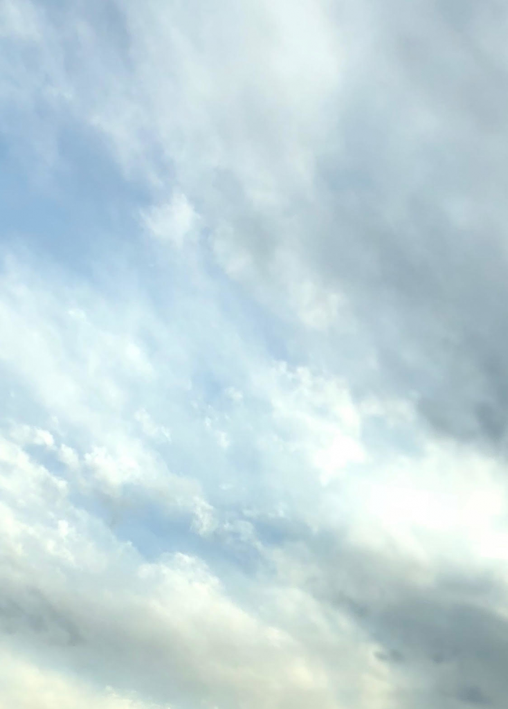
Stratocumulus clouds, March 4, 2018. 5:00 PM
Clouds First, Stephen Morton, March 4
Categories
Search for content or authors
Flow Vis Guidebook
- Introduction to the Guidebook
- Overview 1: Phenomena. Why Does It Look Like That?
- Overview 2: Visualization Techniques
- Overview 3: Lighting
- Overview 4 - Photography A: Composition and Studio Workflow
- Overview 4 - Photography B: Cameras
- Overview 4 - Photography C: Lenses - Focal Length
- Overview 4 - Photography C: Lenses - Aperture and DOF
- Overview 4: Photography D: Exposure
- Overview 4 - Photography E - Resolution
- Overview 5 - Post-Processing
- Clouds 1: Names
- Clouds 2: Why Are There Clouds? Lift Mechanism 1: Instability
- Clouds 3: Skew - T and Instability
- Clouds 4: Clouds in Unstable Atmosphere
- Clouds 5: Lift Mechanism 2 - Orographics
- Clouds 6: Lift Mechanism 3 - Weather Systems
- Boundary Techniques - Introduction
- Dye Techniques 1 - Do Not Disturb
- Dye Techniques 2 - High Visibility
- Dye Techniques 3 - Light Emitting Fluids
- Refractive Index Techniques 1: Liquid Surfaces
- Refractive Index Techniques 2: Shadowgraphy and Schlieren
- Particles 1- Physics: Flow and Light
- Particles 2: Aerosols
- Particles 3: In Water
- Particles 4 -Dilute Particle Techniques
- Art and Science
- TOC and Zotpress test
- Photons, Wavelength and Color

22 Comments. Leave new
This looks like a painting, very beautiful
I like how you focused the image on just the clouds. However, it all seems to blend together and is a little blurry. Better focus of the camera and contrast might help with that. However, great idea!
The silky texture of the clouds look very aetherial. It would make an awesome desktop background. You could play with the brightness / saturation / contrast a bit more to highlight the detail, and maybe improve the sharpness while taking the picture. Unless the clouds were naturally less detailed, of course!
Effective visualization. I wonder if increased focus would resolve more of the cloud physics.
I like the visible details with how close up the image is.
The contrast between the white and blue colors make the image visually appealing. I like how the white of the clouds look like a paint brush streak across the blue sky. Overall, well done!
The angle is interesting. Does look like a sort of a painting. Simple and straight to the point. I like it.
I like how fluid the image is, there are no distracting elements, and the colors are all very subtle and similar with a little bit of texture.
Great image, the details of the clouds are visible. I would consider increasing the contrast so that the different cloud elements are more easily distinguishable. However, the slightly washed out colors do make it resemble a painting.
Great image with a nice focus. I would suggest playing around with the color balance a little.
This looks interesting and is filled with soft colors that sort of imitate an impressionist painting.
The clouds are really interesting – appear very fluffy, almost like a painting.
Cool choice of cropping, this image is one of few that does not include a foreground, which is cool
I like the clouds in this. The framing is nice. I wish the colors were less muted.
The stratocumulus clouds in this image are quite beautiful and make for a pastoral-esque cloud image.
Interesting layering and color distribution. The cropping is interesting, but I like it.
Nice clouds, but kindof hard to see whats happening. I would suggest increasing the contrast to see more detail.
I like the way that there is a strong diagonal that the clouds follow.
A higher contrast might help, but this has a nice effect.
I think adding more contrast would really help bring out details in the clouds. I really like the pastel-like colors in the image.
Nice job It looks like a watercolor.
I like the cropping and rotation in the image a lot, but there’s not much contrast going on.