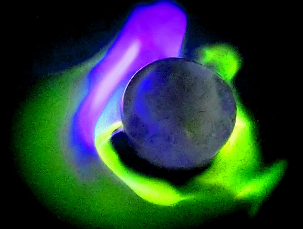
This is an ice sphere covered in lighter fluid and then lit. It has also been color enhanced to changed the flame from orange and blue to green and blue to keep the “cold” feeling along with the ice.
Spring 2018 Team Second – Brent Bauer
Spring 2018 Team Second – Brent Bauer
Categories
Flow Vis Guidebook
- Introduction to the Guidebook
- Overview 1: Phenomena. Why Does It Look Like That?
- Overview 2: Visualization Techniques
- Overview 3: Lighting
- Overview 4 - Photography A: Composition and Studio Workflow
- Overview 4 - Photography B: Cameras
- Overview 4 - Photography C: Lenses - Focal Length
- Overview 4 - Photography C: Lenses - Aperture and DOF
- Overview 4: Photography D: Exposure
- Overview 4 - Photography E - Resolution
- Overview 5 - Post-Processing
- Clouds 1: Names
- Clouds 2: Why Are There Clouds? Lift Mechanism 1: Instability
- Clouds 3: Skew - T and Instability
- Clouds 4: Clouds in Unstable Atmosphere
- Clouds 5: Lift Mechanism 2 - Orographics
- Clouds 6: Lift Mechanism 3 - Weather Systems
- Boundary Techniques - Introduction
- Dye Techniques 1 - Do Not Disturb
- Dye Techniques 2 - High Visibility
- Dye Techniques 3 - Light Emitting Fluids
- Refractive Index Techniques 1: Liquid Surfaces
- Refractive Index Techniques 2: Shadowgraphy and Schlieren
- Particles 1- Physics: Flow and Light
- Particles 2: Aerosols
- Particles 3: In Water
- Particles 4 -Dilute Particle Techniques
- Art and Science
- TOC and Zotpress test
- Photons, Wavelength and Color


25 Comments. Leave new
Creative and beautiful, it seems like a professional picture
The colors are really nice and I like how you created the flow.
Fun colors! The ISO might have been too high. Even if you’re shooting in RAW, a high ISO will still cause graininess. You might have also been a bit destructive in your editing, though I could be wrong there. The color and concept is excellent though, and I love the laminar flame.
Awesome shot. I love the shape, orientation, and color of the flame. Nice focus and composition as well.
The graininess is a bit distracting. There’s a few really cool reflections going on in this image. I like what you did with the coloring in post.
Cool colors, I wish the flames were a little clearer.
Iso might be a little high but awesome colors. I really like the green flame.
Neat
Great colors. Projector screen definitely makes it look even more grainy. Solid shot though.
Really cool concept for an image and compositionally it works really well. The color shift is a nice touch.
Nice capture. Why do you think the flame is only visible on the left side of the ice sphere?
Really cool image. I like the colors choice. It’s interesting that the flame surface is oscillating around the ice ball.
I love the colors here. The shape is awesome too. Having the ice ball is really interesting. The image quality is a little unfortunate but the image is still very aesthetically pleasing.
I like the color inversion quite a bit. The contrast of the smooth purple flame to the grainy green flame works well here.
Great image, the manipulation of the colors is excellent and creates a great aesthetic. The image is very grainy, but this adds to the aesthetic and does not obscure the physics.
The colors and textures of this submission are elegant and alien. The physics are clear and I like how you provided visual weight to the ice ball and the flame by centering the subjects.
I like the colors and the contrast of hot and cold. It looks a bit alien.
Little grainy, but beautiful colors and overall image!
Cool looking image, but the image is pretty grainy.
The altered color of the image is a great touch. The ISO could have played into the graininess of the image, but overall the composition is great!
I really like this image. I would recommend maybe trying to lighten the image because the ice is hard to see. Otherwise, good job!
Neat image. Although the blur effects it a bit, I think it looks fine.
It looks as though you used a very high ISO for this picture, which may contribute to the fuzziness. Great color choice in post-processing. It’s cool how the flame reflects off the ice.
The blur is a little distracting but the colors came out real nice
The ISO may have been a little high, but the colors in the image still look great.