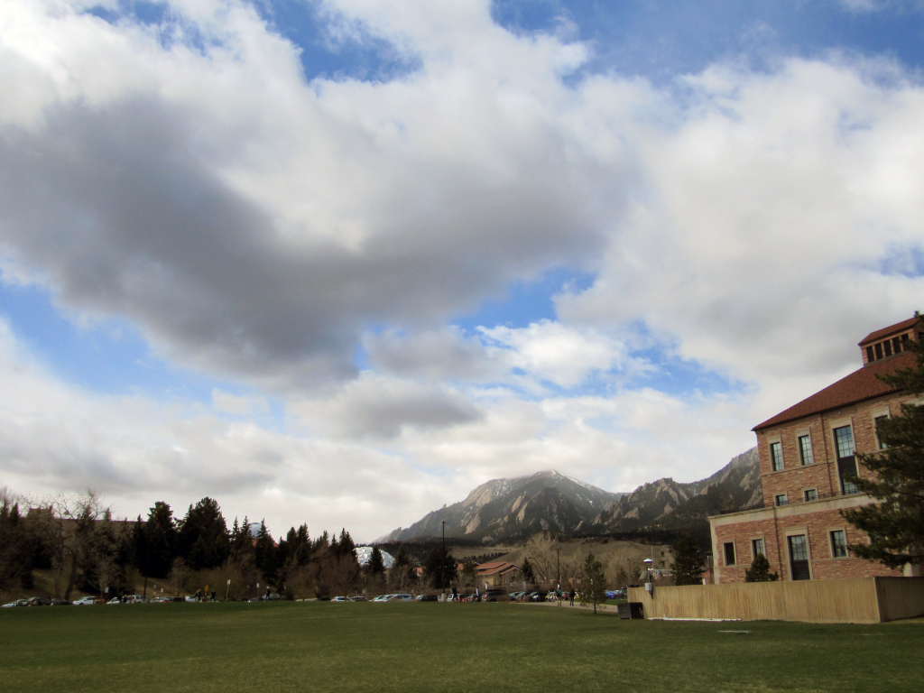
Clouds Second – Gabriel Elbert
Categories
Search for content or authors
Flow Vis Guidebook
- Introduction to the Guidebook
- Overview 1: Phenomena. Why Does It Look Like That?
- Overview 2: Visualization Techniques
- Overview 3: Lighting
- Overview 4 - Photography A: Composition and Studio Workflow
- Overview 4 - Photography B: Cameras
- Overview 4 - Photography C: Lenses - Focal Length
- Overview 4 - Photography C: Lenses - Aperture and DOF
- Overview 4: Photography D: Exposure
- Overview 4 - Photography E - Resolution
- Overview 5 - Post-Processing
- Clouds 1: Names
- Clouds 2: Why Are There Clouds? Lift Mechanism 1: Instability
- Clouds 3: Skew - T and Instability
- Clouds 4: Clouds in Unstable Atmosphere
- Clouds 5: Lift Mechanism 2 - Orographics
- Clouds 6: Lift Mechanism 3 - Weather Systems
- Boundary Techniques - Introduction
- Dye Techniques 1 - Do Not Disturb
- Dye Techniques 2 - High Visibility
- Dye Techniques 3 - Light Emitting Fluids
- Refractive Index Techniques 1: Liquid Surfaces
- Refractive Index Techniques 2: Shadowgraphy and Schlieren
- Particles 1- Physics: Flow and Light
- Particles 2: Aerosols
- Particles 3: In Water
- Particles 4 -Dilute Particle Techniques
- Art and Science
- TOC and Zotpress test
- Photons, Wavelength and Color

16 Comments. Leave new
I like the clouds against the texture of the building. The colors and framing are really nice.
Interesting perspective it makes the clouds seem low
The business field is always an incredible place for landscape photography! I like how misty the clouds were near Bear Peak!
Nice focus on the sky. It’s a good angle to include the business building and just enough of the mountains.
I’m curious to know if the mountain mist forms as a result of standing mountain waves.
The composition of the image is pretty sweet, I like the hard edges of the building against the misty clouds. I think the saturation could possibly be bumped up to really make it pop.
The perspective in this image is fantastic. You get a nice sense of scale due to your decision to include the business building on the right and the mountains at the center of the image. It really illustrates how gigantic the clouds are.
Great capture of the clouds over the mountains.
Great image, I like the variety of colors, though you may want to adjust the saturation and contrast to make the colors more vibrant.
Nice colors, very soft and inviting. I like the most over the mountain as well. ISO might be a bit high, some grain in the clouds.
The image looks a bit fuzzy, might have been taken on a cell phone. The composition is nice, neat clouds.
This is a nice image, I think the building could either be cropped or expanded on, seems like it’s only half-supposed to be there
The clouds in this image are cool. I like the soft colors, but the shapes look sort-of unfocused.
Nice image. I think the building on the right is a little distracting so maybe crop some/all of it out to add to the composition of the photo.
The yellowish tint of the foreground contrasts the blue of the sky quite well.
Nice work. I like the way that the cloud edges look.