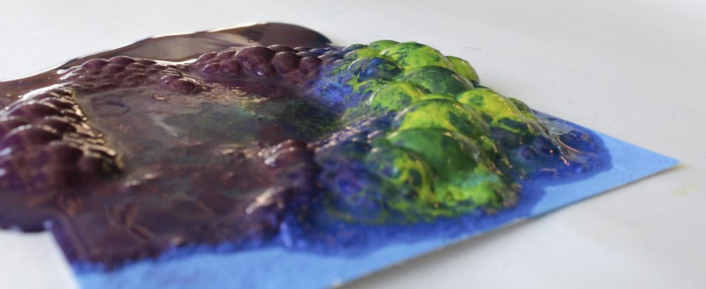
We were motivated to work with colors again for this project; it kind of turned into a theme for us this semester. I made this image with Summer.
We mixed equal parts painter’s pigment and baking powder with alcohol into a paint, and painted little pictures with it. We painted on 4x4in square cards of plain drawing paper. We didn’t paint pictures of anything in particular, just blobs of color next to and on top of each other; we were trying to create a lot of color boundaries because we assumed that that’s where the most interesting flow interaction would take place. After painting, we let the cards dry completely in the sun (to speed up the process). Once dry, we poured vinegar onto the paintings. The result, which we expected, were bubbling paintings that came to life. This experiment was really a variation on what happens in elementary school classrooms across the country every year: when you mix and acid (vinegar) with a base (baking powder, of which baking soda is the main component), carbon dioxide bubbles are produced.
Original image.
This image was taken from about six inches away, with the camera flush on the table. We were right next to a window, so lighting is natural. The fact that we were using white poster board as a backdrop really helped. The focal length of the lens was 20mm; aperture f / 8.0; shutter speed 1/125sec; ISO 2000. In post I cropped it and messed with the colors a bit, mostly the purples and blues.
I wish the focus of this image was different; I think if I were to do it again I would put a tripod above the painting so that the lens was perpendicular to the flow, and try to capture it that way. Additionally, I think I would paint the painting differently, so that there’s even more color boundary interaction. This is another exciting exploration of color, and it was really fun to create this phenomenon with paint – felt like a very creative, very off-the-cuff process.

16 Comments. Leave new
I like how the image looks like a mountain and gives a sense of depth.
Love the depth and color scheme this image provides
I really like the texture of the fluid, it looks kind of like a topographic map with a bunch of funky colors. The white background also makes the rest of the image pop which is good.
Before seeing this picture, I didn’t realize how much depth this experiment had! Excellent. I’m excited to hear how you made this in the report.
I love how terrifying it is. like an alien explosion of growth.
Great image, no idea how you got such a cool effect. The colors and texture make it in a league of its own.
Love the angle of the shot and the detail on the bubbles. The picture turned out really well!
Love the colors and the bubble mountains. Even though you shot this at f8.0 your depth of field is a bit shallow. But I also see you are at 2000 iso so maybe it would be tough to bump up the aperture.
Excellent texture, and the image really portrays the three-dimensional qualities of the subject. I would like to see what would happen if the focus were on the foreground instead of the background.
Nicely composed image. Good depth of field and use of a soft backdrop.
The angle is really nice in this image and I like being able to see the bubbles rising. The focus is great and the colors are great!
The focus on this image is really good! The bubbles in this image look really interesting. Good framing and use of color.
this image is really different, I like the original idea you had with this project. I wish the front of the image was a little more in focus since my eye is drawn there first.
Kind of looks like a mountain range surrounded by water. I like the different perspective, well done!
Lot of texture in this image! The depth really adds to this image compared to a 2D image.
Really cool image almost look like a mountain