Team Third – Gabriel Elbert
Categories
Flow Vis Guidebook
- Introduction to the Guidebook
- Overview 1: Phenomena. Why Does It Look Like That?
- Overview 2: Visualization Techniques
- Overview 3: Lighting
- Overview 4 - Photography A: Composition and Studio Workflow
- Overview 4 - Photography B: Cameras
- Overview 4 - Photography C: Lenses - Focal Length
- Overview 4 - Photography C: Lenses - Aperture and DOF
- Overview 4: Photography D: Exposure
- Overview 4 - Photography E - Resolution
- Overview 5 - Post-Processing
- Clouds 1: Names
- Clouds 2: Why Are There Clouds? Lift Mechanism 1: Instability
- Clouds 3: Skew - T and Instability
- Clouds 4: Clouds in Unstable Atmosphere
- Clouds 5: Lift Mechanism 2 - Orographics
- Clouds 6: Lift Mechanism 3 - Weather Systems
- Boundary Techniques - Introduction
- Dye Techniques 1 - Do Not Disturb
- Dye Techniques 2 - High Visibility
- Dye Techniques 3 - Light Emitting Fluids
- Refractive Index Techniques 1: Liquid Surfaces
- Refractive Index Techniques 2: Shadowgraphy and Schlieren
- Particles 1- Physics: Flow and Light
- Particles 2: Aerosols
- Particles 3: In Water
- Particles 4 -Dilute Particle Techniques
- Art and Science
- TOC and Zotpress test
- Photons, Wavelength and Color


15 Comments. Leave new
This image is really cool I like how defined how the interface between the colors are.
Awesome color scheme. This blends nicely together.
Interesting color scheme, I like the texture and the diffused colors
This looks more like artwork you might see in a gallery. Really pretty!
Great image, I like the framing and the colors are great.
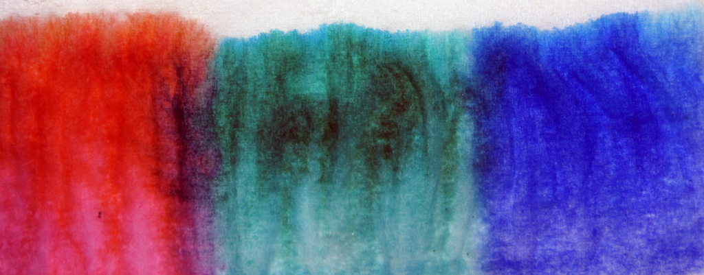
Excellent demonstration of capillary action. Why did the red color appear to rise faster than the other colors? The off-white of the paper contrasts well with the color tones. The texture of the colors on their top edges is an artistic statement when you look at the texture of the tissue: that colors tend to draw the eye more than the lack of color.
It is interesting how the lines stayed pretty defined for each of the colors and moved at about the same rate. Cool composition, I really enjoy it.
The pastel colors and the appearance of the texture make this look like an old gallery painting. Really beautiful.
I love how clean and beautiful this image is. I want it in a gallery!
Awesome work. What causes the black in the center?
Really interesting framing. This image almost looks like a work of modern art! The texture in the tissue paper really adds to the image, and the way the colors are rising and interacting is really cool.
Cool image. It has a lot of artistic merit. The colors are nice.
Really neat idea! What’s the dark gray in the light blue?
Really into the simplicity in this image.
I like the texture and detail in the image, good color choice as well.