Check out my report to find out more about this image!
Team Second // Seeing Shadows // Owen Brown
Categories
Search for content or authors
Flow Vis Guidebook
- Introduction to the Guidebook
- Overview 1: Phenomena. Why Does It Look Like That?
- Overview 2: Visualization Techniques
- Overview 3: Lighting
- Overview 4 - Photography A: Composition and Studio Workflow
- Overview 4 - Photography B: Cameras
- Overview 4 - Photography C: Lenses - Focal Length
- Overview 4 - Photography C: Lenses - Aperture and DOF
- Overview 4: Photography D: Exposure
- Overview 4 - Photography E - Resolution
- Overview 5 - Post-Processing
- Clouds 1: Names
- Clouds 2: Why Are There Clouds? Lift Mechanism 1: Instability
- Clouds 3: Skew - T and Instability
- Clouds 4: Clouds in Unstable Atmosphere
- Clouds 5: Lift Mechanism 2 - Orographics
- Clouds 6: Lift Mechanism 3 - Weather Systems
- Boundary Techniques - Introduction
- Dye Techniques 1 - Do Not Disturb
- Dye Techniques 2 - High Visibility
- Dye Techniques 3 - Light Emitting Fluids
- Refractive Index Techniques 1: Liquid Surfaces
- Refractive Index Techniques 2: Shadowgraphy and Schlieren
- Particles 1- Physics: Flow and Light
- Particles 2: Aerosols
- Particles 3: In Water
- Particles 4 -Dilute Particle Techniques
- Art and Science
- TOC and Zotpress test
- Photons, Wavelength and Color

17 Comments. Leave new
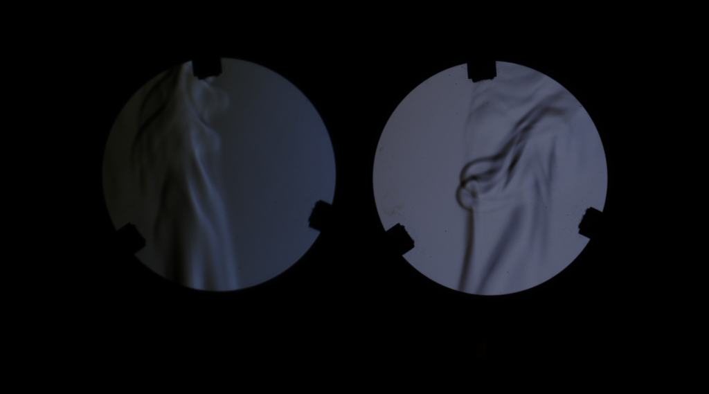
As before, great job! Could you give a better description of this submission? The photo has great contrast. Is the second clip some delta time later?
Beautiful composition. I love the motion in the image. Did you consider aligning the segments to be more symmetrical? Also, try using different shutterspeeds to experiment.
The shadows provide a nice contrast to the image! Have you considered trying to make the left image brighter?
Super cool idea, looks very sciency! The image almost looks a little out of focus still but that could be because of the doubles you are talking about.
Super cool image really like the dark color scheme of the image with the two different views of the heat from the match
Its cool that you were able to get this technique to work. It turned out very interesting! I think that the left image could be brightened up a bit to make it more clear
Great experiment. I like the pattern the heat made.
This could easily be printed and hung on a wall. It has really great framing and a great color scheme.
Interesting picture, cool physics going on. Very interesting.
I like the lighting design in this image. The shadow enhance the depth of the view.
Great explanation of the experiment. The one on the right is definitely my favorite of the two. If this could somehow be colored that would turn out spectacular
The flow looks great! To show the different brightness between two images is great idea. Nice job!
Great Images and great idea. the shadow looks great. the lift picture is a little dark. great work.
This is an interesting composite of images – I like that you chose a way of capturing a common flow in a unique way. The right image is much more contrasted than the left one, what made you decide to include both?
Great job describing the image and how it was created. I really like the contrast between the black and the blue.
So cool, great display of diffraction of flow, nicely done.
I really like the contrast in the right-hand image. The left-hand image seems slightly darker than you probably intended but overall the images are great!