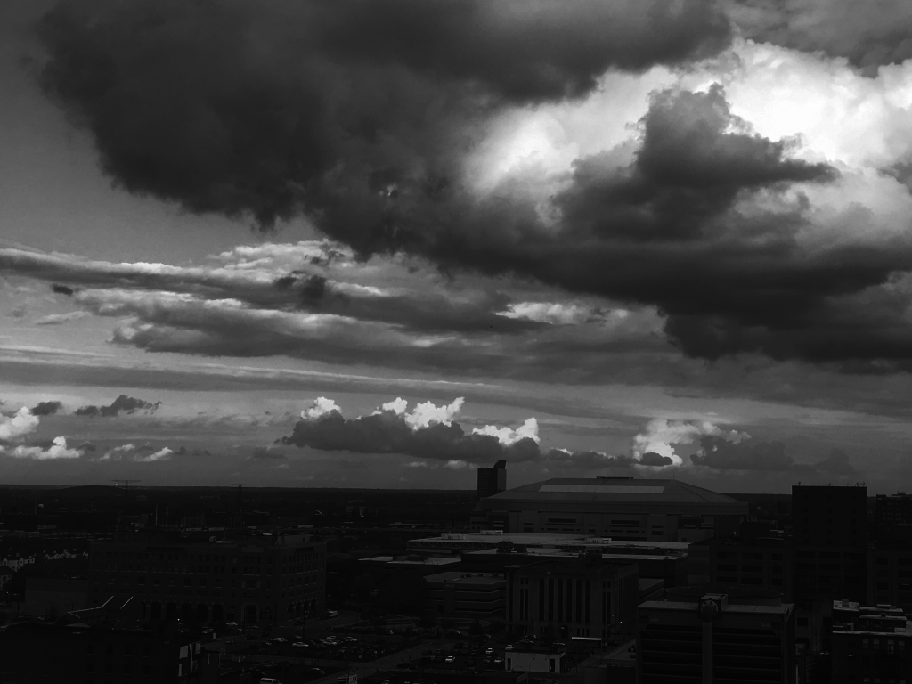
Taken in Saint Louis on November 2nd. Read the report here
Anna Lynton
Categories
Flow Vis Guidebook
- Introduction to the Guidebook
- Overview 1: Phenomena. Why Does It Look Like That?
- Overview 2: Visualization Techniques
- Overview 3: Lighting
- Overview 4 - Photography A: Composition and Studio Workflow
- Overview 4 - Photography B: Cameras
- Overview 4 - Photography C: Lenses - Focal Length
- Overview 4 - Photography C: Lenses - Aperture and DOF
- Overview 4: Photography D: Exposure
- Overview 4 - Photography E - Resolution
- Overview 5 - Post-Processing
- Clouds 1: Names
- Clouds 2: Why Are There Clouds? Lift Mechanism 1: Instability
- Clouds 3: Skew - T and Instability
- Clouds 4: Clouds in Unstable Atmosphere
- Clouds 5: Lift Mechanism 2 - Orographics
- Clouds 6: Lift Mechanism 3 - Weather Systems
- Boundary Techniques - Introduction
- Dye Techniques 1 - Do Not Disturb
- Dye Techniques 2 - High Visibility
- Dye Techniques 3 - Light Emitting Fluids
- Refractive Index Techniques 1: Liquid Surfaces
- Refractive Index Techniques 2: Shadowgraphy and Schlieren
- Particles 1- Physics: Flow and Light
- Particles 2: Aerosols
- Particles 3: In Water
- Particles 4 -Dilute Particle Techniques
- Art and Science
- TOC and Zotpress test
- Photons, Wavelength and Color


17 Comments. Leave new
Very nice image. Like the black and white take on this image. I like that you were able to capture some nice dark clouds in contrast to the other ones we have seen.
Cool image, I like the black and white effect and the details of the cityscape.
I like the black in white in the image, it creates a depressing feel but brings out the clouds wonderfully.
This photo has a dramatic, foreboding mood.
I like the conversion to black and white, it helps to highlight the shapes of the clouds
You’ve once again managed to capture a really amazing depth of field with your cloud image. I really like the “glass table” under the cloud effect that the perspective in this image gives.
I like the black and white in this a lot. It gives the feeling of an impending storm, very bleak and dreary, in a cool way.
This is cool in black and white, nice choice! It looks great. If you straightened the horizon I think it would be perfect
I like the artistic choice of choosing B&W. A little nit harder to see the details in the bad, but it gives a mysterious vibe to the image.
Nice capture of very turbulent looking clouds even the cape is 0. I like the editing of the black and white contrast, gives a very old city-scape feel to the picture.
I like the choice of darkness for this photo. It makes it feel more stormy. It also gives us a large view versus the view of the flatirons that most of us are used to looking at in these photos.
The black and white is really cool for this image – the highlights/shadows of the clouds are really nice.
good black white cloud image. Its very foreboding.
Great job with the post processing the black and white adds a really “eerie effect to the photo
You might consider focusing on the clouds rather than the foreground. I love the black and white, but the image is weighed down by the lower frame.
It looks like there might be some distracting buildings at the bottom of the frame and I think what you did with making the image black and white shifted the focus back to the clouds.
like the black and white imagery of the photo, really bring attention to the clouds.