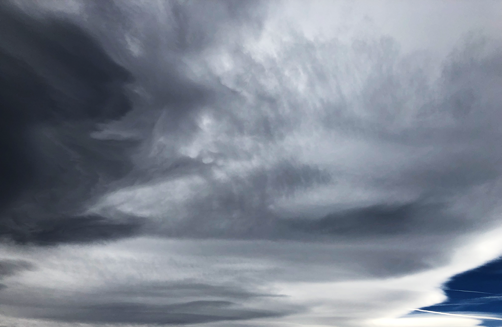
Cloud pic 2
Cloud Second // Garrett Gerchar
Categories
Search for content or authors
Flow Vis Guidebook
- Introduction to the Guidebook
- Overview 1: Phenomena. Why Does It Look Like That?
- Overview 2: Visualization Techniques
- Overview 3: Lighting
- Overview 4 - Photography A: Composition and Studio Workflow
- Overview 4 - Photography B: Cameras
- Overview 4 - Photography C: Lenses - Focal Length
- Overview 4 - Photography C: Lenses - Aperture and DOF
- Overview 4: Photography D: Exposure
- Overview 4 - Photography E - Resolution
- Overview 5 - Post-Processing
- Clouds 1: Names
- Clouds 2: Why Are There Clouds? Lift Mechanism 1: Instability
- Clouds 3: Skew - T and Instability
- Clouds 4: Clouds in Unstable Atmosphere
- Clouds 5: Lift Mechanism 2 - Orographics
- Clouds 6: Lift Mechanism 3 - Weather Systems
- Boundary Techniques - Introduction
- Dye Techniques 1 - Do Not Disturb
- Dye Techniques 2 - High Visibility
- Dye Techniques 3 - Light Emitting Fluids
- Refractive Index Techniques 1: Liquid Surfaces
- Refractive Index Techniques 2: Shadowgraphy and Schlieren
- Particles 1- Physics: Flow and Light
- Particles 2: Aerosols
- Particles 3: In Water
- Particles 4 -Dilute Particle Techniques
- Art and Science
- TOC and Zotpress test
- Photons, Wavelength and Color

15 Comments. Leave new
I enjoy the black and white brush strokes feel you talked about while presenting. Well done.
I like the marbleish pattern to the image. I also like how you gave black clouds contrasting with the white ones.
It looks like the cloud is clawing out and the dark blue in the bottom left looks wonderful
I like the sharp contrast in the cloud in this photo.
great cloud. liked you fully framed the cloud.
The texture of the cloud really stands out and looks great. The color gradient from grey to blue looks very good.
This is a really cool picture. I love the deep dark blue in the bottom right corner, and the paintbrush effect on the cloud.
really nice. We chose the same day to capture the clouds, and you did a nice job grabbing the textures of the sheet. You might consider moving to a grey scale image, because I don’t find the blue adding a whole lot.
I actually like the gray color and the smoothness and the inclusion of the blue color to the right. I wouldn’t alter this image, I think you did a good job as it is.
I really like this image! It really looks like a painting
Woah, great job. This photo shows some nice effects of the clouds and different layers between each region
I like how dark this picture is and how it shows the different layers well. I also like the overall deep blue tint.
Good job with the contrast of the image. I know you were trying to take out the blue, but the little blue in the corner is actually appealing to me
Wow, this looks like a sketch! Can you include the Skew-T?
This is a nice image that captures a good contrast between the blue sky in the bottom right hand corner and the clouds in the majority of the picture. I find it slightly hard to tell exactly what’s going on with clouds taking up the whole frame though.