Get Wet // Robert Giannella
Categories
Search for content or authors
Flow Vis Guidebook
- Introduction to the Guidebook
- Overview 1: Phenomena. Why Does It Look Like That?
- Overview 2: Visualization Techniques
- Overview 3: Lighting
- Overview 4 - Photography A: Composition and Studio Workflow
- Overview 4 - Photography B: Cameras
- Overview 4 - Photography C: Lenses - Focal Length
- Overview 4 - Photography C: Lenses - Aperture and DOF
- Overview 4: Photography D: Exposure
- Overview 4 - Photography E - Resolution
- Overview 5 - Post-Processing
- Clouds 1: Names
- Clouds 2: Why Are There Clouds? Lift Mechanism 1: Instability
- Clouds 3: Skew - T and Instability
- Clouds 4: Clouds in Unstable Atmosphere
- Clouds 5: Lift Mechanism 2 - Orographics
- Clouds 6: Lift Mechanism 3 - Weather Systems
- Boundary Techniques - Introduction
- Dye Techniques 1 - Do Not Disturb
- Dye Techniques 2 - High Visibility
- Dye Techniques 3 - Light Emitting Fluids
- Refractive Index Techniques 1: Liquid Surfaces
- Refractive Index Techniques 2: Shadowgraphy and Schlieren
- Particle Physics: Flow and Light
- Dilute Particle Techniques - Under Construction
- Particles 2: Aerosols
- Particles 3: In Water - Under Construction
- Art and Science
- TOC and Zotpress test
- Photons, Wavelength and Color

27 Comments. Leave new
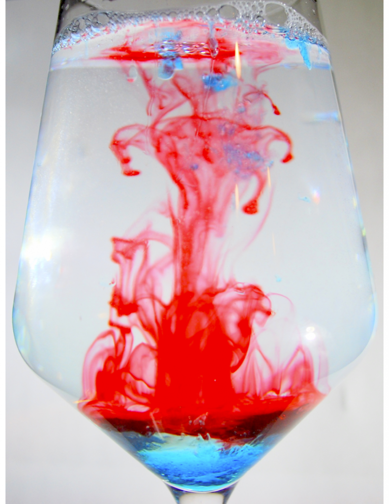
I like that you were able to capture some of the red coloring swirling back on itself as it rose from the bottom of the glass.
I like the framing/cropping of your image. You get to see the whole scientific apparatus while still being close enough to see all of the flow.
This image looks like a jellyfish and I like that. Great job.
The symmetry in this image is almost perfect, and the cropping is spot-on. There’s a few reflections off the glass (that look like candle flames?) that are a bit distracting, but overall I really like the flow visualization and red/blue color contrast in this image.
Cool photo, this image reminds me of eating fire cracker popsicles on a hot summer day
I like how the path of flow of the red food coloring is visible. The blues and reds complement each other.
I really enjoy the diverse colors and flow in this photo.
I like how you can see the contrast between food coloring and soap at the bottom of the glass as well as the shape of the dye cloud.
The colors and bubbles look great. Maybe more shutter speed would make it look more focused.
I like the juxtaposition between the red food coloring and the blue dish soap and how it settles at the bottom of the glass.
I love the color contrast of the red food coloring and dish soap. Very interesting flow patterns of the food coloring. What do you think about the focus on the red ink?
I love the combination of red and blue in this picture, and the bubbles at the top adds more to the picture. I don’t know why, but there seem to be a bit of a quality drop in the middle.
The colors in the image are great and the lighting really works in this photo as well.
I like how you used food coloring and soap to demonstrate the phenomena
Nice image! I like the lighting in the image and the choice to have the whole wine glass in the image. It helps create a balance in the image with the fluid changing in the middle
Nice choice of colors in this image, the contrast does a good job of highlighting the flow while providing an image that is pleasant to look at.
I like the cool effect of the dye that you were able to capture, there is a lot of nice movement!
I like that the difference in densities is apparent from just looking at the picture.
I like the red and blue colors against the white background, it allows the audience to really see the movement of the food coloring in the water.
I love the contrast of the photo, the white background really make the fluid standout?
I love how the dish soap separated into its own layer at the bottom.
I really like all the texture that came out in the picture. The food coloring was a really smart idea to help show the difference in density between the soap and water.
Cool picture, it’s interesting to see how the food coloring and soap interact based on the varying densities. The shape reminds me of Aku from Samurai Jack for some reason
I love the color and the different apparent textures including the bubbles. I wish that the slight glare of the light was removed in the glass.
I think the shape of the wine glass creates a beautiful shape for the image. The colored flow has a great shape as it falls.
I love this image so much. I love the framing of the wine glass and the colors you used. My one comment would be, I wish the red was more in focus. The blue is clearly in focus but I wish the red was because it seems to be the centerpiece of the image.
I like the use of red and blue colors. They are very vibrant and contrast well with each other to make an interesting picture.