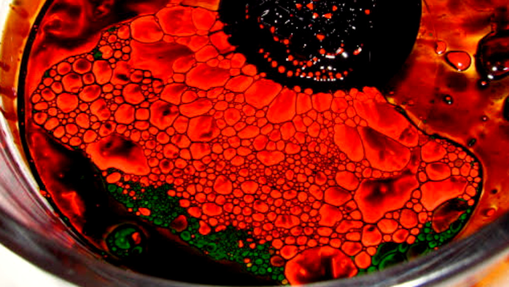
This image was taken by pouring ferro fluid into a glass bowl with drops of red and green India ink poured on top. There is a magnet under the glass bowl, forming a black mass to form at the top of the picture, while causing a slight incline of the glass bowl. This incline forced the India ink to the bottom of the image.

17 Comments. Leave new
Cool image, I think the saturation of the red is a little distracting from the flow of the ferrofluid.
I love the contrast of the green and red in the image.
This reminds me of a stain glass design.
The green poking through the red and black is a subtle but very powerful eye-catcher in this image.
This image reminds me of a pretty flower as seen under red light. The red dots in the spikes of the ferrofluid reminds me of pollen.
Good job! I like the angle that you decided to take the picture. I would recommend for your image to focus on the flow itself and eliminate the glass rim, I think the rim is distracting from what you’re trying to bring out in the image.
The contrast between the dark and the color brings out the details of the image very well.
I like the colors you chose to use.
Good cells pictured in this image, I do enjoy the colors you used, reminds me of a Black Widow Spider
The cells turned out awesome! I love how vivid the green is.
The photo does look a little grainy when zoomed in. But the colors in the image are nice and vibrant
I like how you can see the cells like you said; they remind me of scales on a lizard or something
I like the colors you chose, it reminds me of a red flower with a black center.
The cell definition is beautiful and it is very neat to see the flow pattern within the cell. The contrast of green to red is mesmerizing!
The cells in this image are beautiful. The red green and black make a very strong combo.
The color palette reminds of me poppy flowers.
This experiment has a lot more of a bubbly look to it. It’s neat. The colors personally don’t work for me, but thats because I’m red green color blind, and so the contrast is a bit lacking for me.