Team Second // Abby Rinerson

Categories
Flow Vis Guidebook
- Introduction to the Guidebook
- Overview 1: Phenomena. Why Does It Look Like That?
- Overview 2: Visualization Techniques
- Overview 3: Lighting
- Overview 4 - Photography A: Composition and Studio Workflow
- Overview 4 - Photography B: Cameras
- Overview 4 - Photography C: Lenses - Focal Length
- Overview 4 - Photography C: Lenses - Aperture and DOF
- Overview 4: Photography D: Exposure
- Overview 4 - Photography E - Resolution
- Overview 5 - Post-Processing
- Clouds 1: Names
- Clouds 2: Why Are There Clouds? Lift Mechanism 1: Instability
- Clouds 3: Skew - T and Instability
- Clouds 4: Clouds in Unstable Atmosphere
- Clouds 5: Lift Mechanism 2 - Orographics
- Clouds 6: Lift Mechanism 3 - Weather Systems
- Boundary Techniques - Introduction
- Dye Techniques 1 - Do Not Disturb
- Dye Techniques 2 - High Visibility
- Dye Techniques 3 - Light Emitting Fluids
- Refractive Index Techniques 1: Liquid Surfaces
- Refractive Index Techniques 2: Shadowgraphy and Schlieren
- Particles 1- Physics: Flow and Light
- Particles 2: Aerosols
- Particles 3: In Water
- Particles 4 -Dilute Particle Techniques
- Art and Science
- TOC and Zotpress test
- Photons, Wavelength and Color

19 Comments. Leave new
Very cool colors.
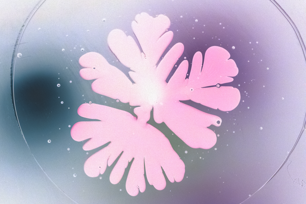
The inversion of colors here makes it really easy to see the imperfections and tiny dots of fluid between the fingers of the Hele Shaw cell, looks great!
How did you invert this image? It is different than your other group members that did this, but regardless it looks very detailed and I like it.
The pink in this is really vibrant and gives a totally different feel than mine.
The image almost looks like a butterfly
I really like how you inverted this image. Very well done.
It makes me think of a cell or some tissue under a microscope. I really like the areas towards the middle where if you look hard enough, you can see the 3D appearance of the blob.
I think it was a great idea to invert the colors, it brings out more detail and the colors that came out are beautiful! It reminds me of cotton candy/magic/unicorns!
I like how the right side of the image is purple and the left is blue.
I love how the background when inverted effects the overall image. The small dots on the petri dish add an interesting element to the image.
The color inversion really gives it a more happy feeling to it. Good job
I like that this reminds me of winter snow.
I like this color because it makes the image look like a painting!
I really like the colors that are present in your image. The transition of colors in the background are a nice accent.
The inverted colors gives it an ethereal vibe, where sometimes the inverted colors can look very sci-fi and artificial. This is much softer and calmer which I like.
Really great color choices in post processing. I enjoy the specks around Hele Shaw cell.
I really like the effect you got with inverting the colors of the image! The pick is very soft and nice
Very pretty pastels I think inverting is very smart!
I really like the decision to invert the image. This picture has very gentle colors