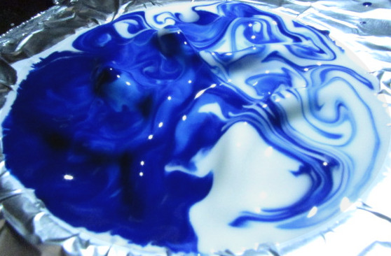
This is a mixture of cornstarch and water sitting on top of aluminum foil, which is resting on a speaker. The speaker was playing different sound waves at different frequencies, causing the mixture to vibrate.
Team Second // Blake Chin
Categories
Search for content or authors
Flow Vis Guidebook
- Introduction to the Guidebook
- Overview 1: Phenomena. Why Does It Look Like That?
- Overview 2: Visualization Techniques
- Overview 3: Lighting
- Overview 4 - Photography A: Composition and Studio Workflow
- Overview 4 - Photography B: Cameras
- Overview 4 - Photography C: Lenses - Focal Length
- Overview 4 - Photography C: Lenses - Aperture and DOF
- Overview 4: Photography D: Exposure
- Overview 4 - Photography E - Resolution
- Overview 5 - Post-Processing
- Clouds 1: Names
- Clouds 2: Why Are There Clouds? Lift Mechanism 1: Instability
- Clouds 3: Skew - T and Instability
- Clouds 4: Clouds in Unstable Atmosphere
- Clouds 5: Lift Mechanism 2 - Orographics
- Clouds 6: Lift Mechanism 3 - Weather Systems
- Boundary Techniques - Introduction
- Dye Techniques 1 - Do Not Disturb
- Dye Techniques 2 - High Visibility
- Dye Techniques 3 - Light Emitting Fluids
- Refractive Index Techniques 1: Liquid Surfaces
- Refractive Index Techniques 2: Shadowgraphy and Schlieren
- Particles 1- Physics: Flow and Light
- Particles 2: Aerosols
- Particles 3: In Water
- Particles 4 -Dilute Particle Techniques
- Art and Science
- TOC and Zotpress test
- Photons, Wavelength and Color

10 Comments. Leave new
The flow is interesting as is without colors, but with them you added another dimension to this photo and made it very aesthetically pleasing!
Love how you added some color to your image, which allowed for me to clearly see what is happening.
I like how the oobleck peaks basically act as a wall and the ink looks like it is flowing downstream.
Even though the ink spilled I think it looks really cool.
Having two contrasting colors was a good addition to the picture. You can really see the curves better in the dark blue streaks
Nice choice of colors
I like the mixing of the two colors and how this picture turned out to be!
Unique pattern, I like the color choice! Nice work!
Great dilution of the color into the grey of the oobleck. I really enjoy the contrast.
Great choice of color, I like the chaotic feel the waves in the surface show.