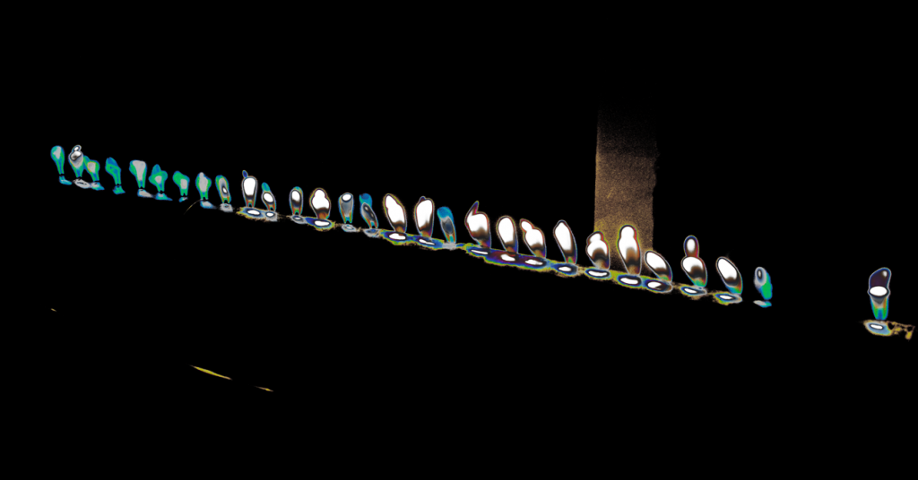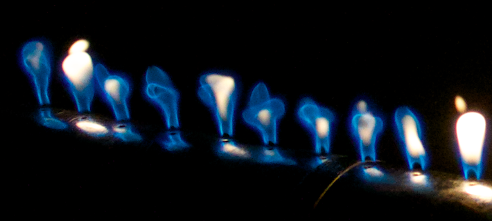
This is an image of flames through a Rubens tube in windy atmospheric conditions. On the left (seen more clearly in supplementary image provided below) are flames with clearly defined edges as there is minimization of radiation emitted by the soot formed in the flame. The brighter flame bodies on the right show significant illumination due to soot formation. The shape of the flames, even without post–processing, resemble human–like caricatures, especially on the left. Hence, the purpose of post–processing techniques applied was to bring out a “Heat–vision” style approach to what appears to be a line of humans crossing a bridge at night time.


10 Comments. Leave new
Amazing post editing!
I like the unique shapes of the flames and the colors added in post-processing.
I really like the post processing you did, it has a cool effect and shows the detail of the flames.
I agree with your observations and statements of meaning regarding ‘people crossing a bridge’. This is a cool image that doesn’t necessarily look like flames. Very cool.
I like the heat vision style shown in the edited image.
I like the post processing and how it came out. It looks like heat vision and how it came out.
The edges of the flames are very prominent. I really enjoy the unedited, cropped image.
I really like how you outlined the shape of the flame. The last image is very unique.
I like the odd colors of the image
I like the post editing, it looks animated