Team Third // Faisal Alismail

Categories
Flow Vis Guidebook
- Introduction to the Guidebook
- Overview 1: Phenomena. Why Does It Look Like That?
- Overview 2: Visualization Techniques
- Overview 3: Lighting
- Overview 4 - Photography A: Composition and Studio Workflow
- Overview 4 - Photography B: Cameras
- Overview 4 - Photography C: Lenses - Focal Length
- Overview 4 - Photography C: Lenses - Aperture and DOF
- Overview 4: Photography D: Exposure
- Overview 4 - Photography E - Resolution
- Overview 5 - Post-Processing
- Clouds 1: Names
- Clouds 2: Why Are There Clouds? Lift Mechanism 1: Instability
- Clouds 3: Skew - T and Instability
- Clouds 4: Clouds in Unstable Atmosphere
- Clouds 5: Lift Mechanism 2 - Orographics
- Clouds 6: Lift Mechanism 3 - Weather Systems
- Boundary Techniques - Introduction
- Dye Techniques 1 - Do Not Disturb
- Dye Techniques 2 - High Visibility
- Dye Techniques 3 - Light Emitting Fluids
- Refractive Index Techniques 1: Liquid Surfaces
- Refractive Index Techniques 2: Shadowgraphy and Schlieren
- Particles 1- Physics: Flow and Light
- Particles 2: Aerosols
- Particles 3: In Water
- Particles 4 -Dilute Particle Techniques
- Art and Science
- TOC and Zotpress test
- Photons, Wavelength and Color

7 Comments. Leave new
Looks like amber!
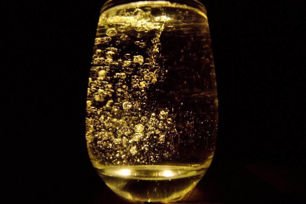
I think you should make the gold color a bit more saturated, it would add to the feel of the image overall in my opinion.
It would have been nice to have some of the water spots on the right side of the glass to be cleaned up. However, I love the editing you did to make it gold and black.
I think its interesting how the glass is nearly split down the middle, where bubbles are on one side and no bubbles are on the other side.
nice! I enjoy the gold like tint
I think the color editing you gave the photo is really neat, at first I thought it was just the original colors, but I’m now seeing how much more vibrant than regular vegetable oil. I think that you should maybe take this editing even further and make it more dramatic because it took me a while to even notice it.
I like the color choice. I also like how this picture is differentiated from the rest of your team