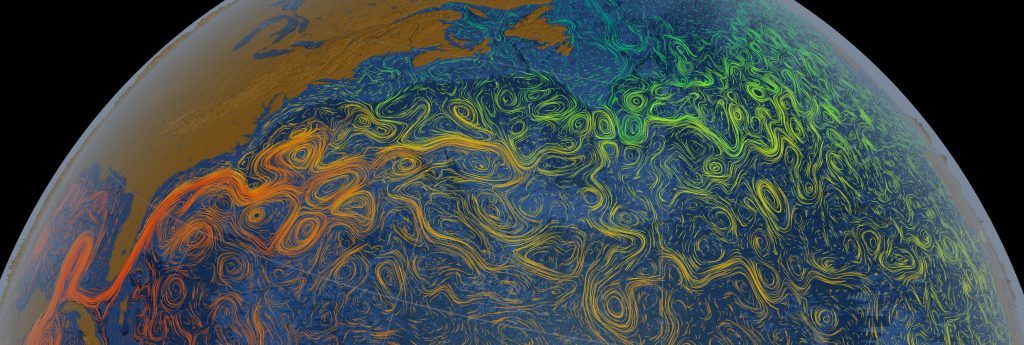
This visualization, captured by NASA, shows the course of the Gulf Stream, stretching from the Gulf of Mexico to Western Europe through bright ripples of color representing the temperature of the water. This photo is fascinating because of the intense bright colors and the movement of the ocean that is visible through these colors. The swirls captivate your eyes and then guide them through the photo allowing you to experience the wide range of color presented. This image shows the sea surface flows along with the light and dark patterns under the ocean that represent the bathymetry (topography) of the water.
Best Of Web // Olivia Ward
Categories
Search for content or authors
Flow Vis Guidebook
- Introduction to the Guidebook
- Overview 1: Phenomena. Why Does It Look Like That?
- Overview 2: Visualization Techniques
- Overview 3: Lighting
- Overview 4 - Photography A: Composition and Studio Workflow
- Overview 4 - Photography B: Cameras
- Overview 4 - Photography C: Lenses - Focal Length
- Overview 4 - Photography C: Lenses - Aperture and DOF
- Overview 4: Photography D: Exposure
- Overview 4 - Photography E - Resolution
- Overview 5 - Post-Processing
- Clouds 1: Names
- Clouds 2: Why Are There Clouds? Lift Mechanism 1: Instability
- Clouds 3: Skew - T and Instability
- Clouds 4: Clouds in Unstable Atmosphere
- Clouds 5: Lift Mechanism 2 - Orographics
- Clouds 6: Lift Mechanism 3 - Weather Systems
- Boundary Techniques - Introduction
- Dye Techniques 1 - Do Not Disturb
- Dye Techniques 2 - High Visibility
- Dye Techniques 3 - Light Emitting Fluids
- Refractive Index Techniques 1: Liquid Surfaces
- Refractive Index Techniques 2: Shadowgraphy and Schlieren
- Particles 1- Physics: Flow and Light
- Particles 2: Aerosols
- Particles 3: In Water
- Particles 4 -Dilute Particle Techniques
- Art and Science
- TOC and Zotpress test
- Photons, Wavelength and Color

2 Comments. Leave new
Third prize for best of web. The captured large-scale flow visualization of flows across the earth is incredible. The crispness of the image as well as the choice of colors to visualize the flow and land also create great aesthetics in this image.
I want to post for recognition here. Normally simulations are interesting but don’t have as much credibility as visualization of natural phenomena, but the fact that in this case satellite data informed the simulation model means we can see a legitimate representation of what large scale ocean currents are doing, and that is awesome. This is one of those images that opens the eye to a high level of perspective on global fluid physics that people wouldn’t see by just photographic imaging. Really nice find. Thanks for sharing.