Best of Web – Kelly Sikora
Categories
Search for content or authors
Flow Vis Guidebook
- Introduction to the Guidebook
- Overview 1: Phenomena. Why Does It Look Like That?
- Overview 2: Visualization Techniques
- Overview 3: Lighting
- Overview 4 - Photography A: Composition and Studio Workflow
- Overview 4 - Photography B: Cameras
- Overview 4 - Photography C: Lenses - Focal Length
- Overview 4 - Photography C: Lenses - Aperture and DOF
- Overview 4: Photography D: Exposure
- Overview 4 - Photography E - Resolution
- Overview 5 - Post-Processing
- Clouds 1: Names
- Clouds 2: Why Are There Clouds? Lift Mechanism 1: Instability
- Clouds 3: Skew - T and Instability
- Clouds 4: Clouds in Unstable Atmosphere
- Clouds 5: Lift Mechanism 2 - Orographics
- Clouds 6: Lift Mechanism 3 - Weather Systems
- Boundary Techniques - Introduction
- Dye Techniques 1 - Do Not Disturb
- Dye Techniques 2 - High Visibility
- Dye Techniques 3 - Light Emitting Fluids
- Refractive Index Techniques 1: Liquid Surfaces
- Refractive Index Techniques 2: Shadowgraphy and Schlieren
- Particles 1- Physics: Flow and Light
- Particles 2: Aerosols
- Particles 3: In Water
- Particles 4 -Dilute Particle Techniques
- Art and Science
- TOC and Zotpress test
- Photons, Wavelength and Color

8 Comments. Leave new
First Place:
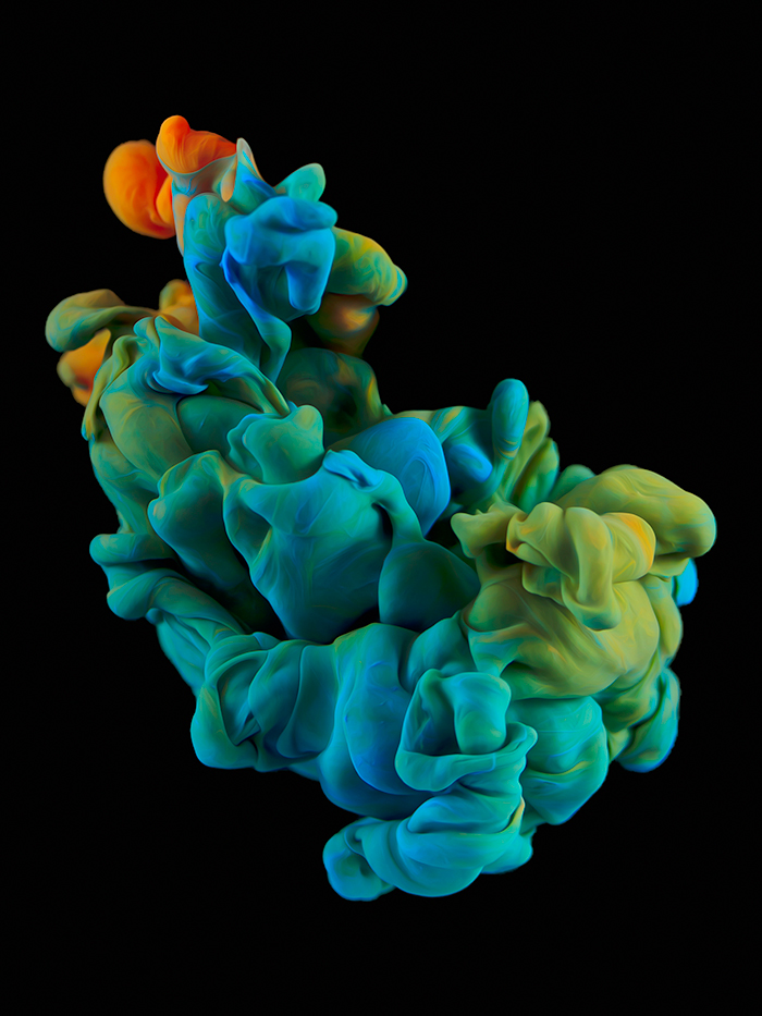
This image is a great example of the intersection of art and science. The vibrant colors give great depth and the high contrast ratio of the subject and background help accentuate the flow. This is an amazing moment of the paint pluming into the water, it creates an interesting sense of visual synesthesia.
Second Prize – The contrast created in the image is amazing and it pops out like it is floating in space.
First Prize – The contrast is amazing in this photo. The flow of the acrylic paint really pops and you can see the little details of it (the wrinkles). It also looks like cloth or a close-up of an organism which adds to the beauty of the photo.
Third Prize: This picture has a dreamy feel, it almost takes you to a different location far from reality! The Black background is perfect!
First Prize
I really like the set up which made the picture really look beautiful .
First Prize: the striking contrast between the paint and the background really makes this image pop. The intricate folds of the structure make the paint look less fluid-like which is a really cool effect.
Second Place – the setup for this picture is really incredible of how it is completely black in the background and absolutely no glares or anything. The paint looks like fabric which is really cool, really great picture.
First Prize
The visual composition of the smoke-paint-bubble itself is exquisite, not to mention time that must have gone into getting the recipe for it just right. What really sells this one for me is the chaotic nature of the paint, contained in pristine darkness.