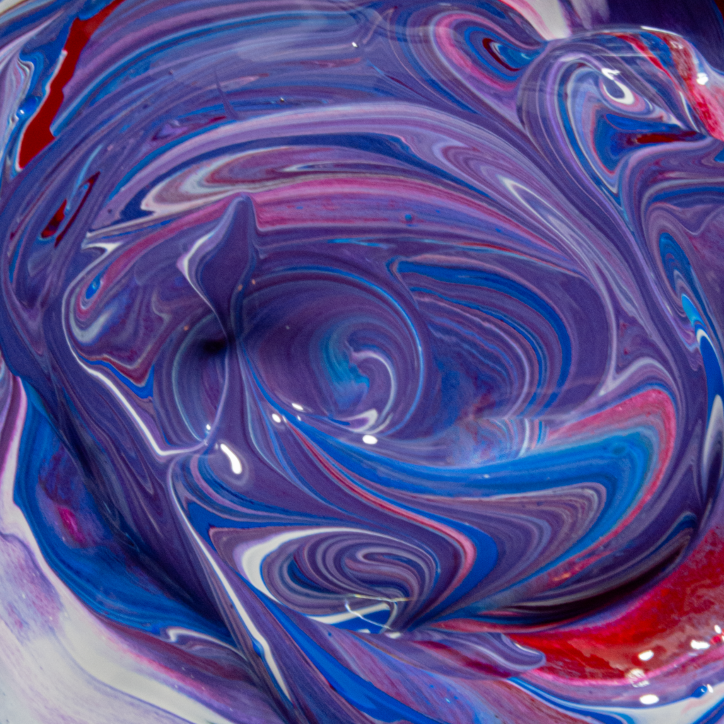
The picture above shows a flow of acrylic colors mixed together.
Mujtaba Al Hubayl – Image 1
Categories
Search for content or authors
Flow Vis Guidebook
- Introduction to the Guidebook
- Overview 1: Phenomena. Why Does It Look Like That?
- Overview 2: Visualization Techniques
- Overview 3: Lighting
- Overview 4 - Photography A: Composition and Studio Workflow
- Overview 4 - Photography B: Cameras
- Overview 4 - Photography C: Lenses - Focal Length
- Overview 4 - Photography C: Lenses - Aperture and DOF
- Overview 4: Photography D: Exposure
- Overview 4 - Photography E - Resolution
- Overview 5 - Post-Processing
- Clouds 1: Names
- Clouds 2: Why Are There Clouds? Lift Mechanism 1: Instability
- Clouds 3: Skew - T and Instability
- Clouds 4: Clouds in Unstable Atmosphere
- Clouds 5: Lift Mechanism 2 - Orographics
- Clouds 6: Lift Mechanism 3 - Weather Systems
- Boundary Techniques - Introduction
- Dye Techniques 1 - Do Not Disturb
- Dye Techniques 2 - High Visibility
- Dye Techniques 3 - Light Emitting Fluids
- Refractive Index Techniques 1: Liquid Surfaces
- Refractive Index Techniques 2: Shadowgraphy and Schlieren
- Particles 1- Physics: Flow and Light
- Particles 2: Aerosols
- Particles 3: In Water
- Particles 4 -Dilute Particle Techniques
- Art and Science
- TOC and Zotpress test
- Photons, Wavelength and Color

7 Comments. Leave new
I really like the mix of colors and how it mixed!
You asked about lighting in class, I think that you could diffuse your light by placing a white sheet or paper towels (multiple even to get the desired effect) to reduce reflections or “hot spots” in the image. Really cool picture and I think it looks great even if you didn’t do this.
This is a really fun photo to look at, the focus is really nice and the highlights make your cool colors pop. The red is also a nice contrast to the surplus and blues. Overall, this is a really nice dynamic composition.
The variation of depth on the surface of the paint provides really interesting perspective and adds to the visual appeal of the swirls, looks great!
I really like the different shapes in this image, it gives a good idea of how the paint was mixed so that we can get some sense of motion. I like the paint colors as well since they create a nice cohesive image.
Ooooooh I like this a lot. The choice of colors to show is very well done and very pleasing to the eye. The only thing I would say to work on is trying to reduce some of the glare from the light in parts of the image, maybe by putting some sort of diffuser on whatever lighting rig you have but other than that I really like the photo!
The mixture of the acrylic colours and the lighting gives it the sense of dynamic motion. Although I would suggest more focus towards the centre of the image.