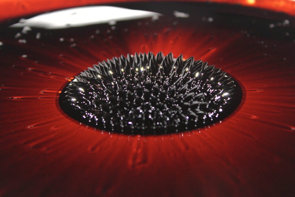
A magnetic field visualized through the shape of ferrofluid. The report can be found below.
IV2 // Lucas Fesmire
Categories
Flow Vis Guidebook
- Introduction to the Guidebook
- Overview 1: Phenomena. Why Does It Look Like That?
- Overview 2: Visualization Techniques
- Overview 3: Lighting
- Overview 4 - Photography A: Composition and Studio Workflow
- Overview 4 - Photography B: Cameras
- Overview 4 - Photography C: Lenses - Focal Length
- Overview 4 - Photography C: Lenses - Aperture and DOF
- Overview 4: Photography D: Exposure
- Overview 4 - Photography E - Resolution
- Overview 5 - Post-Processing
- Clouds 1: Names
- Clouds 2: Why Are There Clouds? Lift Mechanism 1: Instability
- Clouds 3: Skew - T and Instability
- Clouds 4: Clouds in Unstable Atmosphere
- Clouds 5: Lift Mechanism 2 - Orographics
- Clouds 6: Lift Mechanism 3 - Weather Systems
- Boundary Techniques - Introduction
- Dye Techniques 1 - Do Not Disturb
- Dye Techniques 2 - High Visibility
- Dye Techniques 3 - Light Emitting Fluids
- Refractive Index Techniques 1: Liquid Surfaces
- Refractive Index Techniques 2: Shadowgraphy and Schlieren
- Particles 1- Physics: Flow and Light
- Particles 2: Aerosols
- Particles 3: In Water
- Particles 4 -Dilute Particle Techniques
- Art and Science
- TOC and Zotpress test
- Photons, Wavelength and Color


6 Comments. Leave new
I really like the colors in this image, the black center with the streaked red outline makes it look like a pupil and iris.
Really incredible piece, I love the ring of brighter reflections. The only distracting element is the bright white rectangular reflection in the back that could be fixed with a crop.
This photo is absolutely beautiful, you hit the nail on the head in terms of framing, color, and field of view!
I like the color combination between the red and black with the speckle of reflections. It is a great view to look down the rows of spikes. It looks great with the contrast of the red between them.
To answer your question, it would be nice to have the subject area be a little more in focus, but still works for an exceptional image.
I like the glittery, less focused section at the front contrasted with the halo of spikes at the back
The centering of the spikes in this image is really well done, it’s very eye-catching.