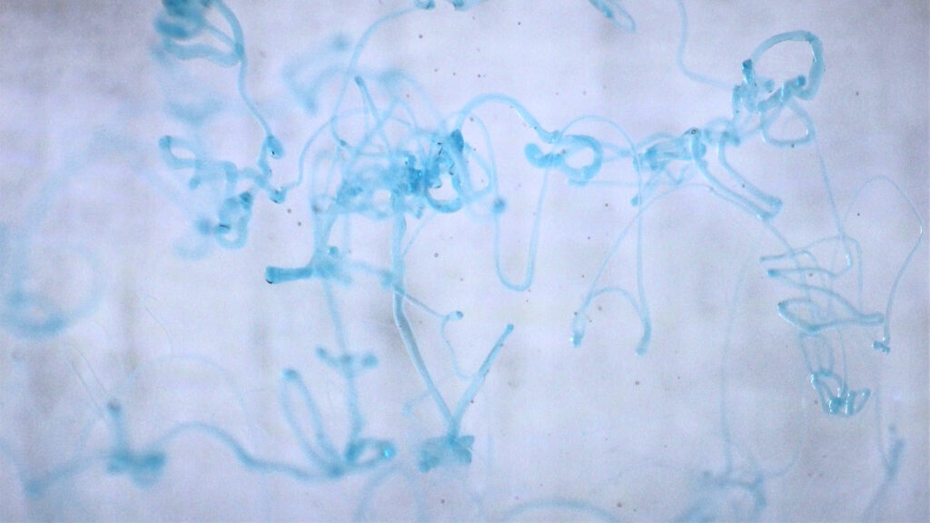
This image captures strings of dish soap being dropped into a tank of water. The dish soap is more viscous than the water so it remains in its stringy form when it enters the water. The report can be found below.
Get Wet / Lucas Fesmire
Categories
Flow Vis Guidebook
- Introduction to the Guidebook
- Overview 1: Phenomena. Why Does It Look Like That?
- Overview 2: Visualization Techniques
- Overview 3: Lighting
- Overview 4 - Photography A: Composition and Studio Workflow
- Overview 4 - Photography B: Cameras
- Overview 4 - Photography C: Lenses - Focal Length
- Overview 4 - Photography C: Lenses - Aperture and DOF
- Overview 4: Photography D: Exposure
- Overview 4 - Photography E - Resolution
- Overview 5 - Post-Processing
- Clouds 1: Names
- Clouds 2: Why Are There Clouds? Lift Mechanism 1: Instability
- Clouds 3: Skew - T and Instability
- Clouds 4: Clouds in Unstable Atmosphere
- Clouds 5: Lift Mechanism 2 - Orographics
- Clouds 6: Lift Mechanism 3 - Weather Systems
- Boundary Techniques - Introduction
- Dye Techniques 1 - Do Not Disturb
- Dye Techniques 2 - High Visibility
- Dye Techniques 3 - Light Emitting Fluids
- Refractive Index Techniques 1: Liquid Surfaces
- Refractive Index Techniques 2: Shadowgraphy and Schlieren
- Particles 1- Physics: Flow and Light
- Particles 2: Aerosols
- Particles 3: In Water
- Particles 4 -Dilute Particle Techniques
- Art and Science
- TOC and Zotpress test
- Photons, Wavelength and Color


6 Comments. Leave new
I very much enjoy the fact that you can see each strand of soap suspended in the liquid. I like the brighter colors of this image, compared to the bulk of dark images in the rest of this category.
I like how distinct and thin the strings of dish soap stay as they collect together and suspend in the water.
I like the depth that is given to the image by the out of focus edges.
It would have been nice to have more of a concentration of soap in the middle focus.
Good choice of color difference.
The image does seem a little bit grainy. It could be an ISO issue (needs more light) or just a lack of clarity in the field of view.
Lucas asked if the background subtracted from the image and I think that the texture adds a bit of depth on top of the focus characteristics. It could be edited out but I think the vertical lines add some movement to the image.
I’m a huge fan of the color contrast. I like how the blue pops on the white background. It adds a little bit of texture.