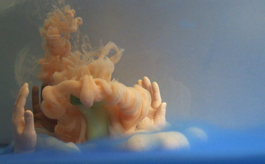
In this image, a paint, dye and water mixture is creating streamlines around stationary objects. Image taken in collaboration with Alessandro Villain, Ella McQuaid, and Max Patwardhan.
IV3 // Marina McCann
Categories
Search for content or authors
Flow Vis Guidebook
- Introduction to the Guidebook
- Overview 1: Phenomena. Why Does It Look Like That?
- Overview 2: Visualization Techniques
- Overview 3: Lighting
- Overview 4 - Photography A: Composition and Studio Workflow
- Overview 4 - Photography B: Cameras
- Overview 4 - Photography C: Lenses - Focal Length
- Overview 4 - Photography C: Lenses - Aperture and DOF
- Overview 4: Photography D: Exposure
- Overview 4 - Photography E - Resolution
- Overview 5 - Post-Processing
- Clouds 1: Names
- Clouds 2: Why Are There Clouds? Lift Mechanism 1: Instability
- Clouds 3: Skew - T and Instability
- Clouds 4: Clouds in Unstable Atmosphere
- Clouds 5: Lift Mechanism 2 - Orographics
- Clouds 6: Lift Mechanism 3 - Weather Systems
- Boundary Techniques - Introduction
- Dye Techniques 1 - Do Not Disturb
- Dye Techniques 2 - High Visibility
- Dye Techniques 3 - Light Emitting Fluids
- Refractive Index Techniques 1: Liquid Surfaces
- Refractive Index Techniques 2: Shadowgraphy and Schlieren
- Particle Physics: Flow and Light
- Dilute Particle Techniques - Under Construction
- Particles 2: Aerosols
- Particles 3: In Water - Under Construction
- Art and Science
- TOC and Zotpress test
- Photons, Wavelength and Color

4 Comments. Leave new
This is an amazing photo, great job! I love the use of bright, vibrant colors around not ordinary objects to create an eerie but inviting environment.
I like that the hands look like they’re containing the flow, it makes the whole image look kind of magical. To answer your question about the saturation, I noticed when I was editing that I couldn’t turn up the orange without bringing it out too much in the skin tone of the hands, so I think it was the right decision to keep it where you did.
I like the two-toned color of the dyes pluming down. The vortex rings off the figure is a great feature. The blue rolling fog along the bottom it a very unique border to the image.
The two color pigments really accentuates the rolling cloud falling over the figure. If I were editing this image, I would probably crop out some of the empty space on the right to better focus on the subject.