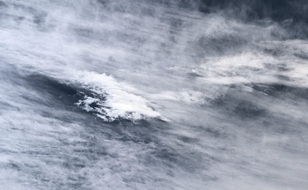
I took this photo while I was out on a hike that started at the NCAR Trailhead on 30 September. The entire photo includes the mountains, however I felt that it detracted from the flow visualization of the clouds. I cropped it down to include the most interesting portion of the clouds to focus on the flow.
Clouds First – Hannah DelGuercio
Categories
Flow Vis Guidebook
- Introduction to the Guidebook
- Overview 1: Phenomena. Why Does It Look Like That?
- Overview 2: Visualization Techniques
- Overview 3: Lighting
- Overview 4 - Photography A: Composition and Studio Workflow
- Overview 4 - Photography B: Cameras
- Overview 4 - Photography C: Lenses - Focal Length
- Overview 4 - Photography C: Lenses - Aperture and DOF
- Overview 4: Photography D: Exposure
- Overview 4 - Photography E - Resolution
- Overview 5 - Post-Processing
- Clouds 1: Names
- Clouds 2: Why Are There Clouds? Lift Mechanism 1: Instability
- Clouds 3: Skew - T and Instability
- Clouds 4: Clouds in Unstable Atmosphere
- Clouds 5: Lift Mechanism 2 - Orographics
- Clouds 6: Lift Mechanism 3 - Weather Systems
- Boundary Techniques - Introduction
- Dye Techniques 1 - Do Not Disturb
- Dye Techniques 2 - High Visibility
- Dye Techniques 3 - Light Emitting Fluids
- Refractive Index Techniques 1: Liquid Surfaces
- Refractive Index Techniques 2: Shadowgraphy and Schlieren
- Particles 1- Physics: Flow and Light
- Particles 2: Aerosols
- Particles 3: In Water
- Particles 4 -Dilute Particle Techniques
- Art and Science
- TOC and Zotpress test
- Photons, Wavelength and Color


6 Comments. Leave new
Hey there Hannah!
I love this image! I almost wish you decided to leave the mountains in to provide perspective on how big this cloud formation really was. Other than that I love the cloud selection. It almost looks like an avalanche after heavy snow fall. Good job!
Very well done! It looks more like an oil painting than an actual photo! I love that it’s almost gray scale while still have a slight tint of color.
I really like the color scheme you selected. I also enjoy that the clouds were cropped without a foreground because it allows for interpretation by the viewer and I think that’s really unique.
I really like the way you edited the image. I think the contrast between the dark sky and the bright clouds creates a really interesting visual .
I think the framing of this image is unique and creates a interesting texture that jumps off the screen.
I like that you chose to focus one section of the original image and darkened the sky. It creates a nice contrast that makes the edges of the cirrus/altostratus clouds really clear!