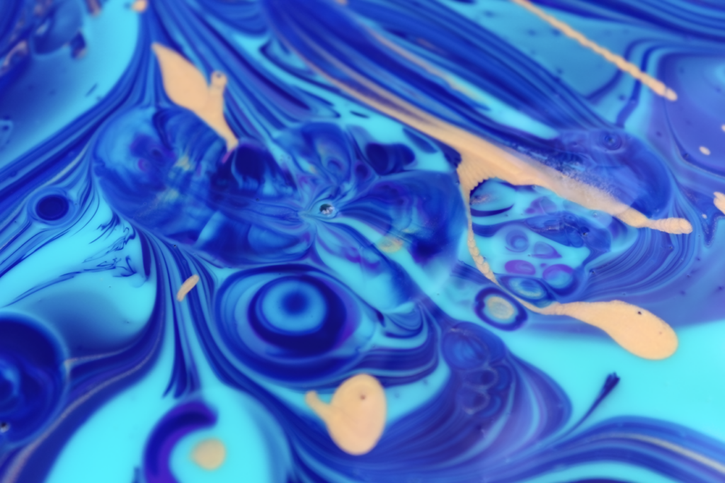
In this photo we attempted to photograph the Rayleigh-Taylor Instability using Acrylic Paint. A 10 inch by 10 inch canvas was laid on top of a plastic protective sheet and approximately 2-5 ounces of acrylic paint was poured onto it. While the paint is poured, laminar flow must be used to ensure that there is no mixing of the paint.
Team 2nd/Team Kohlrabi/Jakubczak
Categories
Flow Vis Guidebook
- Introduction to the Guidebook
- Overview 1: Phenomena. Why Does It Look Like That?
- Overview 2: Visualization Techniques
- Overview 3: Lighting
- Overview 4 - Photography A: Composition and Studio Workflow
- Overview 4 - Photography B: Cameras
- Overview 4 - Photography C: Lenses - Focal Length
- Overview 4 - Photography C: Lenses - Aperture and DOF
- Overview 4: Photography D: Exposure
- Overview 4 - Photography E - Resolution
- Overview 5 - Post-Processing
- Clouds 1: Names
- Clouds 2: Why Are There Clouds? Lift Mechanism 1: Instability
- Clouds 3: Skew - T and Instability
- Clouds 4: Clouds in Unstable Atmosphere
- Clouds 5: Lift Mechanism 2 - Orographics
- Clouds 6: Lift Mechanism 3 - Weather Systems
- Boundary Techniques - Introduction
- Dye Techniques 1 - Do Not Disturb
- Dye Techniques 2 - High Visibility
- Dye Techniques 3 - Light Emitting Fluids
- Refractive Index Techniques 1: Liquid Surfaces
- Refractive Index Techniques 2: Shadowgraphy and Schlieren
- Particles 1- Physics: Flow and Light
- Particles 2: Aerosols
- Particles 3: In Water
- Particles 4 -Dilute Particle Techniques
- Art and Science
- TOC and Zotpress test
- Photons, Wavelength and Color
5 Comments. Leave new
Hey there Peter!
Your group really nailed this setup! I love the color palette you decided to run with. However, the addition of the gold feels like a small afterthought. Other than that I love it. Awesome work capturing the vortices.
I love the colors in this. I have seen images like this, but the choice of using acrylic paint really added to the variety of colors in your image.
I really like the color palette you guys chose for this image, very unique!
I’m absolutely gutted I missed the experimentation of this. It’s so beautiful. I may have to try the technique on my own to check out the flow and create some great art simultaneously.
Hello Peter,
Like I said in the critique I the bright colors in this image are very visually striking. I think the addition of the tan paint helps to break up the blues throughout the image. I also really like the patterns that you were able to capture.